Thursday, April 30, 2015

Wisteria Trunk and Two Trees from Life

 Wisteria Trunk, 7" square
pen and watercolor in Stillman & Birn Zeta journal
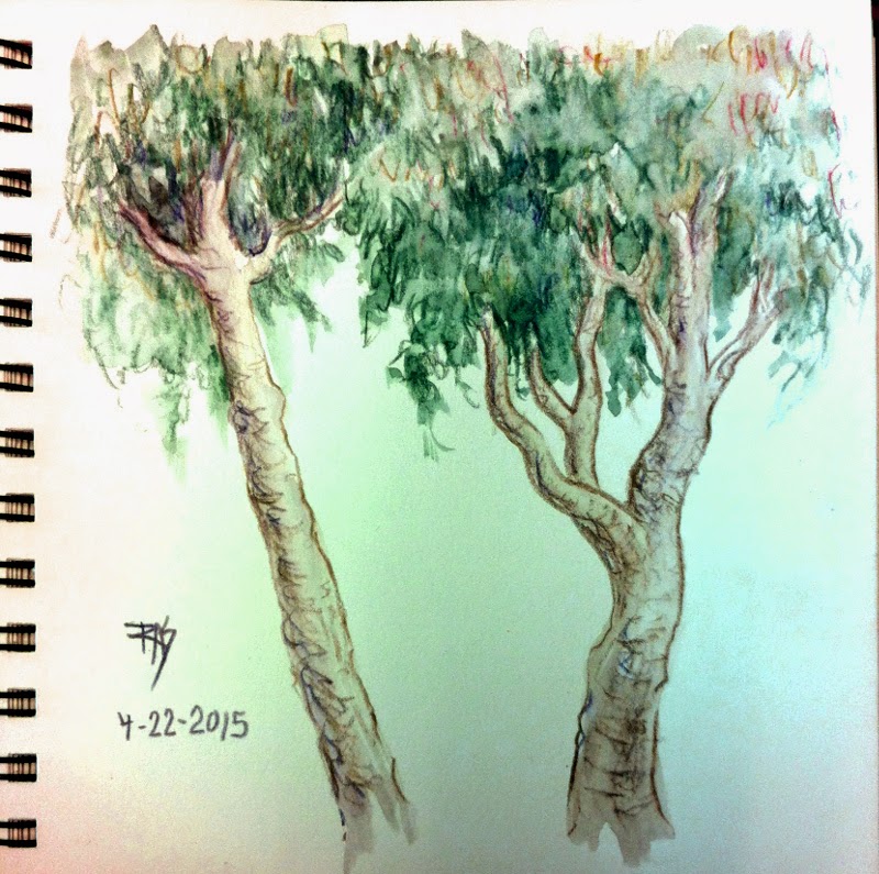
Two Trees from Life
Derwent Graphitint, washed, same journal

I did sketch last week, the two trees were on the ride to my clinic appointment. Literally sketched while the van stopped, about five different trees went into the composite sketch. It's a common type of street tree in San Francisco that always fascinates me. Washed once I was in the waiting room. I love how Graphitints look, the combination of color and soft graphite is powerful and subtle.

On the same trip I sketched the Wisteria trunk from life, out back of the clinic garden in an area I usually go to smoke. That vine's fascinated me for years, it's thicker than my arm at its base and seems more like an extremely crooked tree than a vine. I put in the fence it grows on and the background later on Saturday after I started adding color. It took several days for me to decide on which watercolors to use, then once I'd painted the vine an leaves it looked awful. Everything was about mid-value against white. So I decided to throw in the loose background and fence and it balanced right. Went from one of my worst to one of my favorites that fast!
I'll be coming back to that vine in future. It's blooming now so I might tackle its flowers sometime.

Monday, April 13, 2015

Rose in Rose

Rose in W&N Watercolour Marker
photo reference by KreativeK on WetCanvas

Couldn't resist the title Rose in Rose even if it's actually in Alizarin Crimson Hue. It looks a lot like Permanent Rose to me. Blue shading in Pthalo Blue Red Shade and foliage in Hunter Green, which is more blue cast than the Sap Green marker and washes out beautifully. Lovely deep value range too. 

I got two new markers in my latest supply package along with some frames and yesterday's crayons, so this is very cool. There are a couple of cat references in the same challenge so I might have a go at doing them in markers or in gouache since I replaced my Pelikan Opaque Watercolor set too.

Sunday, April 12, 2015

Crayon Sketches from Memory

Crayon Sketches from Memory: Foxglove, Tomato, Daisy, Copper Ring
Crayola crayons on paper, 8 1/2" x about 6"

Just for a lark, I went ahead and bought the largest set of Crayola crayons available for goofing around in my sketchbook. They're fun. I charted them on the upper part of this page and discovered the range has few neutrals and many near-matches in gradations of magenta to cerise and bright blue-greens. Few tints and darks, but a few darks proved useful and there are many variations on dark blues and violets, one dark green and a maroon. 

The glitter and metallic ones have fairly subtle effects. All are quite transparent, much more so than colored pencils. They were a bit softer than the cheap crayons in that kid set and I was pleasantly surprised at the blending. Good enough for color sketching, a saturated color can always be muted by layering transparent complements!

The white is translucent enough to burnish without altering color, but putting it under another color lightens it substantially. It's always fun to do something in a kid's medium and have it come out the way I wanted things to when I was a kid struggling with them. They still cause a lot of little specks and crumbs though.

Thursday, April 9, 2015

Spring Twig and Tree with Shrubs

Spring Twig and Tree with Shrubs
3 1/2" x 5 1/4" Pocket Moleskine watercolor journal
Pigma Micron 01 (black) and watercolor

Yesterday was my clinic visit and the weather's getting successively better. Enough that I was still functioning well after going down the stairs and could draw! 

My elevator's gone down. There's only one antique elevator in the building and apparently it's going to be months before the replacement motor arrives. This bites. It's going to cut deep into my summer plans. Hopefully if it gets fixed by August or September, I might get a 2015 outing late in the year. But while it's down, my best hope is to stay in for all but essential medical appointments.

I was reading a Claudia Nice book on my Kindle when the van stopped to take on another passenger who was late for the pickup. While we waited I saw this lovely sapling with scanty old dead foliage and its first few new spring leaves opening up simultaneously. Had to sketch that from life.

Then snapped photos from the van window and captured a ridge next to the road with trees and bushes and grass. Later in the waiting room, cropped that photo visually and sketched the tree scene above. Both of those I penciled first, then inked with a waterproof pen and then washed with watercolors. I used watercolor markers in Burnt Umber and Sap Green on the twig and washed, tapping the brush tips with the water brush for lighter color. Then used a little pan set of 8 Daniel Smith watercolors on the tree scene.

A couple of years ago I found that Richeson had a tiny children's watercolor set only an inch and a quarter by under 2" with tiny like quarter-pans round pans of kid color. I bought those for my grandkids as stocking stuffers, I got an extra one for myself, popped out the kid pans and filled the empty little plastic openings with Hansa Yellow, New Gamboge, an orange-red, quinacridone magenta or rose, quinacridone gold, pthalo blue, ultramarine and Paynes Grey.

Weirdly that little keychain set has become so handy. I've always got it in pocket, never have a problem with it other than the ultramarine popping out of its hole, just seem to reach for it and mix those colors easily. Bizarre but it's one of my favorites along with my ubiquitous water brush. Love that quinacridone gold, it's the one color that's wearing down fastest!