Tuesday, December 30, 2014

Siberian Tiger Cub

Siberian Tiger Cub
pastel pencil on paper

Still continuing daily art, at least sketching. Robert Rongier, aka skappy on WetCanvas.com, hosted the Dec. 2014 Animals & Wildlife challenge with a lot of good cat photos among others. So I'm sticking with his references to finish out the month and the year. Thanks to that challenge I really have gotten back to daily drawing. 

Took a long time to get going again after November but it worked.

Monday, December 29, 2014

Mamul Kitten and Tiger Changing Directions

Mamul Kitten charcoal

Both the Mamul Kitten in charcoal and the Tiger Changing Directions in Pan Pastels and charcoal were done in my holiday drawing book, that plain paper 8 1/2" x 11" one that came with the kid stuff. It's still acid free drawing paper and the lightweight sketchbook is inspiring me to sketch large and loose.

Tiger Changing Directions
Pan Pastels and Charcoal

On the tiger, my challenge was blocking him in first with Pan Pastels and no details, then adding the charcoal stripes and bits of shading. That was difficult but what surprised me was how well it worked!

Mamul Kitten was Sunday's daily art, tiger is today's. So I'm definitely back to daily art, now need to get back to daily posting of it too!

Saturday, December 27, 2014

Pan Pastel Iris and Blue Heron Pen Sketch

Pan Pastel Iris
8 1/2" x 11" Pan Pastels on paper

Photo reference by DAK723 for the December Pastel Spotlight challenge on WetCanvas. So I actually painted yesterday, just still so wiped out by this cold that as soon as I did, I went back to bed. Repeatedly.

I've been sleeping and reading mostly, down with a horrible cold-bronchitis that I had most of the week. But my goal for December was to try to get back to daily art and lo, I'm starting to get back to it. Getting there at the end of the month instead of the start still counts.

Today's art: this pen sketch of a blue heron from a different WetCanvas challenge:

Blue Heron
pen sketch on Stillman & Birn Zeta journal

I might have gotten into daily sketching a lot sooner if I'd checked that Animal & Wildlife challenge for December. Not only did skappy post this awesome blue heron taking off across the water, he put in mamul kittens and cats, tigers, lions, various cats and big cats. I am going back to see if I can get in a good tiger sketch or something tomorrow, maybe try to do a bunch of them.

Tuesday, December 23, 2014

Tulips in Pastel

Tulips in Pastel
8 1/2" x 11"

Quick study of two tulips from a photo reference by DAK723 on WetCanvas.com - it's one of the featured photos from the December Spotlight challenge. I used the student grade Mungyo half sticks set of 64 on the Target drawing book that came in my Christmas box. Not the most high end supplies but as a test of these student pastels it was great.

They have a good texture and I can have fun with them on ordinary drawing paper. This isn't even pastel paper, just normal vellum surface but it held about three or four layers, that's not bad. I could easily work up from this to something better of course.

Saturday, December 20, 2014

Breaking Art Block with Crayons

Roses in Crayon on Paper
photo reference by Ronnier at WetCanvas

This month I've been in the artistic doldrums. I spent November writing a novel and a half, got all wound up in Writing Mode and couldn't stop after the month was over. So I was writing sequels to the silly backstory tripe thing I finished Nanowrimo with, essentially fan fiction on some previous novels.

I did one new painting on the 3d with my Winsor & Newton Watercolour Markers, the Trilobites one:

Trilobites in W&N Watercolour Marker

And then nothing till today. This morning the Salvation Army delivered an enormous Christmas box filled with donated presents from my wish list. A gorgeous deep purple velvetish throw blanket, a huge warm deep purple bath towel, a black hoodie, a couple of books - and a letter size acid free sketchbook with medium weight drawing paper plus a Kids' Art Set:

100 piece Kids Art Set

These are anything but artist grade light fast mediums. Crayons, colored pencils, little short markers, cheap oil pastels... but something about it broke the block to smithereens. 

They didn't have these kits when I was a kid. There were watercolor sets and most of those pretty small with 8 colors and a horrible blunt brush (those haven't changed, the horrible blunt brush in this kit will be ignored in favor of a waterbrush for convenience), and boxes of crayons, little packs of colored pencils. That was about it. Not these saturated spectrum colors either. Let alone laid out intense against black to make you want to paint with them.

The ranges are a bit different. Hot Pink never made it into the lineup unless you got the big box of crayons when I was a kid, or the huge watercolor set. Magenta didn't either. Mixing purple was hard back then when your red was always a red-orange and blue was green cast. You'd get gray with "red and blue make purple."

But seeing that, thinking of the people who put together that great gift, I just cut loose and relaxed. I sketched the roses and took the complementary colors challenge of doing them just in red and green. Bang, down went the block. I can now relax and get back to daily painting. That's a lot of sketch pages. I've used about one and a half now. On teh following page is something that's my own holiday present for my readers everywhere:

Ari Cat Coloring Page
pen on paper

The cartoon coloring pad had hippo, elephant, dog, horse, snake... circus animals and pets. But no cat. Not even a lion or tiger for the circus. So I had to try the little short marker pen and fill the gap. Enjoy the Ari Cat Coloring Page. His real points are black mask, brown-beige body, smoke-brown paws and tail. But you can color him any colors you like, why not a purple and yellow Siamese with orange eyes? Or a brown eyed blue-point Siamese? Have fun!

And yes, for the record, I usually do open presents on Solstice Eve. Tomorrow is the Solstice, tonight or tomorrow night is The Longest Night of 2014... after this days will start creeping longer, the quiet soggy march toward spring begin and San Francisco is thirstily drinking up a lot of good rain after a parched summer. It's rained day after day here and we sure needed that.

Purring at you! Hope to post more soon!

Wednesday, November 19, 2014

Rain Clouds over San Francisco Hill

Rain Clouds over Hill
5" x 7"
Winsor & Newton Watercolour Marker, Ivory Black on
W&N Bockingford 140lb Not surface watercolour paper

I already reviewed the paper on Rob's Art Supply Reviews blog. But I had to post this here as well.

Some paintings don't get planned. This wasn't intended to be a good painting. I was on the Paratransit van going to my twice a month clinic visit and at the top of a very tall hill, saw dark rain clouds stop just short of a cluster of trees on top of a far hill which had no houses or anything on it. That took my breath away.

I scrambled to get a photo but the camera showed only white sky, the clouds I wanted the photo for were invisible. So I decided, heck with that. I'll sketch it. Chose the black W&N Watercolour Marker and sketched rapidly at a stop light, then swished my wet Niji waterbrush around scrubbing out the sky marks as thoroughly as possible, then swiped across the hills once each and jiggled it.

I wasn't even thinking. This painted itself. I knew what to do and just tried to get the effect. In under two minutes I stared at it and even wet, I knew. I even said "Stop now" or something like that. I had the moment's recognition that kept me from ruining it. 

This was the time the paint did the work. 

There are effects in this little monochrome painting that I've tried for years to get. They came naturally. I didn't think about it while I was painting. I told my nurse, who's fond of my art, that this one painted itself. It actually did, in under two minutes. Mind and heart and hand and eye were one, it happened on that nonverbal right side of my brain at the pace watercolor needs to happen for some of that kind of effect to happen. If I'd stopped to plan it I would have ruined it.

So this is something for anyone who struggles with watercolor to keep in mind. Keep striving. Keep learning. Keep wasting paper on paintings you hate and duds, keep turning them into pastel underpaintings or store them to see how much better you are a year later - always a good idea. The day does come when the things you learned move out of the right brain into the left, when the tools are at your hand and it's your fingers that know how to use them.

It was my favorite brush this happened with. The lazy easy one. Whether you lean toward flat brushes and blocky, painterly strokes or round brushes and thick-thin calligraphic strokes, there will come a time you can feel your favorite brush and give it exactly the right pressure and wetness, respond in the moment to what's there and let the watercolor guide the process. 

It is a lot of fun, like getting stoned on painting.

It does come, no matter how frustrating its long learning curve is. Usually when trying to do something else and not thinking about it. Watercolor and zen, go together a bit like paint and brushes, right?

Last tip - using good supplies increases your chance of the happy day. Cheap paint on cheap paper sometimes cockles and puddles, is too absorbent or not absorbent enough, gives you problems that mingle with lack of experience to cause disasters. Students learning watercolor are better off getting a triad of good artist grade paint like the Winsor & Newton Permanent Rose, Lemon Yellow and French Ultramarine, or Daniel Smith's Primary Triad set, than trying to get good effects with lesser paint.

Likewise, good paper 140lb or heavier that's adequately sized can make it easier to get those effects. Bockingford is the medium quality Winsor & Newton paper, their Artists' all rag paper is even better but this stuff performed uch better than most and my Stillman & Birn journals also perform brilliantly. Arches and Fabriano Artistico are great too. They each have character and as you try different papers you'll find their strengths and the way they affect your style. 

I don't soak and stretch my watercolor paper because my disabilities and small living space make that completely impractical. I would have to go down to the bath chamber (not latrine) in the hall, then staple it to a big wooden board or clamp it into a stretcher and bring the dripping thing back to my little room. This would throw my back with the carrying and bending and walking, so I wouldn't feel much like painting afterward. 

I like working with the gelatin sizing still in the paper. Other artists prefer stretched paper as it becomes more absorbent. I don't much care for unwanted soft edges in detail areas and like wet-and-dry effects like this, so my style is affected by my body the way it is in all mediums. Those who prefer stretching say it gets more absorbent, but I like paper to give me good sharp details when I want them and dislike that sense of working on a blotter that some papers give. Six of one, half a dozen of the other.

Do it your way. If I did ever stretch I'd get one of the clamp stretchers though. They seem a lot easier than tape and staples and all. I don't have the patience to wreck my back doing that and not get to use it that way. Nature didn't design me to do a lot of heavy preliminary work like stretching my own canvases either or grinding my own pigments.

What I learned from that applies to busy people too. Make it easy on yourself and you'll paint more often, thus learn faster. Years of practice with brush tip pens sketching just to record this or that or taking notes in art classes with brush tip sketches helped lead to this day too. 

I'm still that happy to get to this point. Purring loudly.

Tuesday, November 18, 2014

More Winsor Newton Marker Sketches

Winsor & Newton Watercolour Marker Sketches
Ari cat, white daisy, pears with oranges and persimmon group
Stillman & Birn Zeta journal smooth watercolor paper, 7" square

All those sketches are from life, two from yesterday and one from today. I wanted to test the markers for color studies, for combinations with Niji water brush, for various techniques. I made this page for my review of these markers which I'll post on my other blog, Rob's Art Supply Reviews. Link is on the sidebar.

Novel is still slow, I'm only at 20,000 words or so and should be at 30,000 or so to win on time. But it's a good one, it just takes more rumination than I expected. Might get some work in on it today. Weather is severely slowing me down again just like last year.

Wednesday, November 12, 2014

Monochrome Blue Skyscape

Monochrome Blue Skyscape
Winsor & Newton Watercolour Marker, Prussian Blue Hue
Stillman & Birn Zeta journal 7" square

The other half of this month's new art supplies arrived and so I could not resist at least getting in a test sketch. These markers are everything I hoped they'd be - artist grade watercolor in a marker form for quick sketching and underpainting. Watersoluble, they can be pulled out into midtones and light values with a wet brush or in this case a waterbrush for fast pen and wash studies.

So I goofed around with a familiar subject, imaginary clouds and ways of rendering them in pen. It worked. The loose lines and soft washes worked together and the Prussian Blue Hue has such a great long value range that I'll have no trouble getting darks either in watercolor painting or pen-wash or underpainting pastel field sketches.

I'll be reviewing the Travel Set in my Art Supplies Review blog soon, watch for more details about the product and how it handles. I may do some more tests but as an example sketch, this really worked! I did something I've wanted to do in pen-wash for the longest time - got the sky gradient in, even if exaggerated!

Friday, November 7, 2014

Autumn Shore - Blue Earth Pastels

Autumn Shore
8" x 7 1/2" approx.
Blue Earth "Land & Sea" set of 21
Canson All-Media paper, white

This is a test painting of the new pastels I just got. I finally gave in to the great assortment of values in the Blue Earth sets of 21. It became a real exercise in subsitution as a gorgeous orange tree could not be rendered with just the pastels in the box. Though the result of using the very pale pinkish color for it was interesting and I had fun with it. Not that happy with the big rock in the water, really could have left it out or done it blockier but I kept adjusting color on it to get it gray. 

For an experiment though, it is a great success. I love the range of values in the box, love the juicy impasto strokes and their super soft texture. They're fun to paint with and I can keep going when I thought I was pretty much done with them if I'd been using others. It will take a light hand to get the best out of these and after this I'll definitely also be using the dozen bright sticks I first bought to test the brand. They'll go into a combined box at some point for convenience.

More about them when I review the pastels. I'd like to do a better painting for the review, but I'm happy with this as a test. I love how some of the trees came out and how some of the reflections worked. 

Nothing is wasted. This is just my opinion of it too - others may look and go wow, Rob, you outdid yourself here. I know now what textures I can get on plain paper and the next step is using these on sanded paper - or as finishing layers in a painting done with firmer pastels. They'll shine for that.

Reworked it a little, unsatisfied with the big egg shaped rock in the water. I like it better now.

Autumn Shore, reworked
mostly by adding reeds and moss to the big rock

Thursday, November 6, 2014

Pine from Memory

Pine from memory
5" x 7"
Rembrandt pastels on gray Strathmore Artagain paper

Experimenting with sky holes, asymmetry, graceful shape and painting from memory, I wound up giving it dawn light and snow on the ground - but not on the branches, where it blew off in a strong wind. I've seen pines in a snowy area that lost their snow to wind or sun before all the snow on the ground melted.

I should have been doing my novel, but I painted first. Happily the book's going well now so I took a break to post this. Onward with both! Sometimes it's good to break away for a little while just to paint.

Sketches from Tuesday and Wednesday


Doorway sketched Tuesday afternoon on my way to my polling place. My home care worker was checking on his parking meter, so I settled down for a rest and sketch. Nothing else on Tuesday, too wiped out from the hike.

Wednesday went better at least for sketching. I had my semi-annual doctor's appointment so needed to leave early and decided to stay a little late. That turned into two more hours late because the Paratransit van broke down and then the replacement van broke down. Finally another driver showed up and I got home after 5pm while it was getting dark. Got 326 photos of the garden, clouds and so on though, lots of photos including some sunset skies.

Shadowed tree sketched from the van at a stop light. First of Wednesday's sketches, ballpoint in a pocket Moleskine.

Quick watercolor study from the window of my doctor's office, overlooking the spot I usually wait for the van. I had some Daniel Smith watercolors and a travel brush with me so did this in the watercolor Pocket Moleskine.

Still had some time waiting for the doc, so I penciled and inked another view of the same thing with the color study to combine with it. Same view, same scene. Then I went out to the garden for a little while and got some photos.
Sketched this gold leaf with its delicate brown veins, decided to wait till I got home to ink it so I could use the warm brown pen. It came out better with the pen inking, though I might have glazed over it again. The bottom is the actual leaf pressed into the same page of the pocket watercolor Moleskine.

Still waiting, many photos and some time later...
I sketched in pencil and pen, getting these snapdragons from the garden when I got told it'd be another 45 minutes for the replacement van. Painted it in the waiting area out back by the short fat palm again. By then I was exhausted and it started getting dark, so that was the end of Wednesday's sketching.

What a day! But I had gotten way ahead on my Nanowrimo novel, it's at 9,397 words so I'm still ahead of par as long as I get in some writing tomorrow to keep up. So far this month I've alternated. Beware, there may be gaps again on days I write but don't draw... still hoping to get a good day I can do both!

It's just this month, will be back to daily art in December most likely.

Friday, October 31, 2014

Portrait of the Artist As An Old Coot

Self portrait 
3 1/2" x 5 1/4" pocket Moleskine thin paper
charcoal pencil, no erasing
Yeah, I was squinting. Sketched from life.

Yeah, I stood in front of a mirror with light on one side of my face and sketched myself very fast with a charcoal pencil in a small sketchbook. It was a quick gesture because I could not stay on my feet very long, just like a sketch of my ever-fidgeting 2 minute sleeping cat. I squinted with one eye, which got a little exaggerated with a slightly misplaced line, big deal. I was getting the gist and sketching quick to get mostly the masses of shadow and light in that lighting and general proportions down.

It's no mistake, my face is rather long and narrow especially on the bottom half. I don't have much forehead compared to chin and upper lip. Happens sometimes. The classical Renaissance proportions are a third top of the head, third middle, third lower part from bottom of nose down. I have a short top third. 

I got some effects like the highlight on my eyebrow on the dark side looking light while the shape on the light side was more shadowed. It was fun, hadn't done one of these for years. Yes I have permanent big bags under my eyes, comes from a long hard life with a lot of trouble sleeping due to pain and rouble. Happens. The saggy skin doesn't go away even if the stressor does. The lines are there on my forehead too. If I drew in more detail you'd also see the crow's feet but they were more delicate details.

I don't mind. The hollows and sags and flows of my skin all mark the passage of my life and my face looks very lived in. I stayed up through a lot of long nights and would've been just fine if I hadn't had to get up on the following mornings - always was a night owl! But that's me, a sketch of what I look like. Weirdly I still don't have gray hair and am pushing sixty. I figure when it comes it'll come all at once like it did on my dad - a litle for a year and then wham, silver. And then it'll be a real pain to try to draw it instead of the usual darkish to mid brown.

Fun. When doing self portraits don't idealize, just get it down. It's going to come out better than you expect anyway. Especially under dramatic light. Be sure to give yourself that for the exercise!

Thursday, October 30, 2014

Clouds Coming In

Clouds Coming In
pastel on paper, 8" x 10" horizontal
photo reference by tj84 on WetCanvas.com reference image library

This painting gave me some frustrating moments. I had some design problems with the areas on the land and one patch in the clouds bugged me. So I hung it on the wall across from where I sat and did other pastels and other paintings. Half the procrastination was physical, just not being up to getting out what I needed to finish it.

I went from hard pastels at the start to Rembrandt and finally finished with 120 Unison Half Sticks because that gave me the range I needed for the finish. The shadow area was too muted once I got it to the right value, so bringing in some purples made that work. I played with the foliage some more and having different hues and values in foliage colors helped enormously. 

I put in a tiny patch of sun hitting some distant trees. There's other little fun areas where light causes details. I gradated the water and added the cloud reflections, that helped a lot. It was really just finishing strokes for most of this - but every one of them was needed.

Paintings sometimes go through an Ugly Stage where it looks like you've ruined it. The last details need to be done and the finishing touches, without them it looks horrible but that is the right underpinning for those final touches. I first ran into this doing Colourist works in Charlotte Herczfeld's class because it looks ghastly right before the end - those finishing details are always needed. 

This time I think I just got tired when I was finishing it and looked down, noticed the ugly stage and choked. A couple of friends on WetCanvas provided critique. Many of them said it was better than I thought. Now I think it's better than they've seen - but thanks to them I didn't chuck it, did go finish it. 

I much prefer being decisive and moving on to the next painting than endless reworking! I hope I don't catch the wibbles again like this for a long long time!

Wednesday, October 29, 2014

Yesterday's Cat Gesture Sketch

Ari cat from life
Pigma Micron brush pen
Accordion fold pocket Moleskine

I love that pocket Moleskine for quick pen sketches whether I bring it with me somewhere or just keep it nearby for days when I don't feel up to painting or serious drawing. It's small, handy and interesting. When I stretch out the pages I can see a lot of my sketches together all at once and get an idea of where I was at, what I was doing, whether they improve.

I still usually default to poses where he's standing still. If I'm up to something more difficult like capturing a moving pose mostly from memory, I'm probably going to draw or paint a more different subject in a different journal or something. It's on my mind though, I still want to sketch him clawing his carpet scrap or walking to his food bowl or scampering like a kitten while I dangle the furry snake on a wand - that's almost like a tail, like cats pouncing on each others' tails. I think that's why he likes it so much.

But some days I'm either doing something else or get sick. As we head deeper into fall toward winter, there will be days I'm not up to painting. 

November is NaNoWriMo, National Novel Writing Month. I have participated every year since 2000 and optimistically already preordered a Winner t-shirt because all but 2002 I succeeded in writing a 50,000 word novel in 30 days. Some years I wrote a lot more than that. One year I did almost half a million words in seven novels and the last was nearly finished, took a couple more days to finish the final extra one. It's fun. It's my annual noveling harvest. 

So I am shifting from Art Mode into Writing Mode. November is when Daily Art takes second priority over Daily Writing. Some days I don't manage it. That happens with anything. In all those years I have yet to get progress on every single day of November, but I almost always win. 2002 I didn't start till the 25th and still got respectably past the halfway mark. 

So maybe this year I'll win early and get past that and paint more. Or settle into a comfortable chapter a day pace and do both art and writing on the same day - high goal is to maintain this blog and work on the book consistently. Not that I'll get it but I may get closer to it than usual.

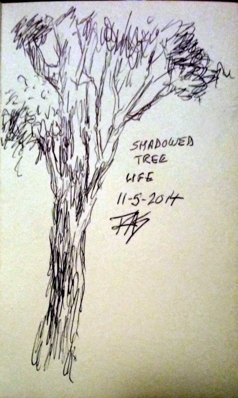
Anything can interrupt but disability is the real reason behind that. I can count on doing one thing in a day and this sketch from the 28th is an example of the most I can do on a bad day. In fact it's better than a worst day because I managed to get that in. 

When I get to the end of the long folded sketch page, I'll turn it over and work back the other direction. It's working out well. Gives me a sense of what I like to sketch from life or photos. I'll finish this page sometime, maybe today, maybe tomorrow or the next day. Probably post the whole page when I do.

So wish me luck on my noveling adventure! I will be back to "daily art has priority" in December. 

Meanwhile, new art supplies are in the offing. I have the happy choice of three affordable art treats. Two out of three would leave my budget completely reasonable with no doing without treats. All three would take a very minor tightening my belt over it. May well be worth it since each of them is very likely to improve my productivity.

Though the two things that most boosted the amount of painting I do is a boost when I got 120 Unison Half Sticks and again at getting 60 Rembrandt Half Sticks.

120 Unisons gave me a visual incentive to use my pastels. It worked directly getting me to set up and use the big set to have all the colors I need right at hand, more than any other set. I put it into the aluminum case that came with my 72 Professional (just general assortment) set on sale and slid the cardboard lid under the tray so the pastels are visible unless I move. For taking it out of the house I'd put the cardboard lid back on. But seeing this across the room made me want to paint, a lot of times I looked at it and picked up a smaller set next to me.

Unisons 120 half sticks

That can be inspirational! Even if your pastels are mixed brands organized in a different box, putting something clear over the tray will give you the sight of all those colors in spectrum array. A colored pencils artist with a studio rack organized by hue and value gets the same effect. Seeing the spectrum with tints and shades and neutrals organized creates an urge to use those tools. 

It'll also tell everyone that comes over that you're an artist, if all the art on the walls doesn't. 

The effect of the 60 Rembrandt half sticks was just as profound and that's more disability related. I wanted 120 half sticks but they were sold out of that new item. I decided half that would make a good plein air set because I've been frustrated at not having the right pastels in an easy form to use when I go out. So I bought it specifically to use on my twice a month trips to the clinic and hour painting in the clinic garden.

Only to find that what works for plein air also works for days when my back won't let me get up. If it's in reach I will use it. After months of Unisons across the room inspiring me to use hard pastels in reach, I had pastels in reach that size. Finally I got a little folding table that holds the larger Unisons set in reach, so I'm actually much better set up for pasteling.

Moving 5 Tints and 5 Deep Darks and a Painters 10 assortment in Pan Pastels put those in reach of my limited space and I used Pan Pastels more too. For that my pastel journal is awesome - good paper, sanded if I want to prime it but good if I don't have the energy to prime and so far going very well.

I was doing several pastel paintings a year, at best one or two a month on the Spotlight challenge when active on WetCanvas. Now all of a sudden the logistic is solved and my supplies are in reach, easy to use along with reasonably lap sized pieces of paper and pads. I bought full sheets of Uart paper and cut them down to 9 x 12" or 12" squares depending on shape in 3 grits - 500, 600 and 700 or 800, the finer grits. I like them all but working small it's better to have a finer grit. With more than one piece in those grits I started using them.

Staying stocked up on needed supplies like paper and getting tools that fit my real situation more than my daydreams helps a lot. 9 out of 10 times my obsession with plein air supplies is that they are marginal day supplies. If I can't get outside, I can still go there in memory and paint it.

I'll post again if I paint today. This may be another cat sketch or a good painting. I won't know till it's done. Might just be a writing day as November draws nearer.

Edit on the 30th: forgot to post again but did do another drawing on the 29th. A friend asked for critique on a portrait and I did a loose diagram of face shadows to explain what I meant by breaking the face into two main tonal areas to get the likeness. So here is my diagram of their model's pretty face. Not perfect but gets the gist across!

Face diagram and Ari sketch page
pocket accordion fold Moleskine

I could have added more details but didn't, left out some of the small shadows in the light side for one thing. And linear accents like the eyebrows themselves and so on. But it is a map for where to look for shadows on your model's full face photo or in her face with side lighting. Your shapes WILL vary. These are likely places to find light and shadow values. Eyebrows and eyelashes and the line between the lips or even the teeth in a smile are details. Ears are not in this sketch because they weren't shown in his portrait - either he or the model didn't want to show them.

Human ears are silly looking and placed funny, so I can completely understand!

Monday, October 27, 2014

Orange Tree by the Lake

Orange Tree by the Lake
7" square pastel on 
Stillman & Birn Beta Journal 
Photo by StormeRider (LiveJournal)

Storme and Nonny gave me permission to use a number of beautiful photos they took when they lived in Massachusetts a while back. I copied it and saved it and meant to paint the autumn scene - today's the day I did.  Very different from the photo's composition and by the time I was done they weren't the same trees either. But I loved the reference and it gave me a very clear memory of the forms and colors of a forest that is turning - some trees all the leaves are gone or brownish gray, last few bits of warm color, others still green or starting to turn, the blazing center beauties rivaling flowers in their glory.

I've seen scenes like this so many times in my life. All the years I was in New York State. All the years in Chicago or Minnesota or Kansas or Arkansas or Colorado, so many places I've lived had these scenes and roads soaring through it. I've been on drives just to see the fall colors. Taken photos I lost later on, that happened often, but it's all there in memory and this reference opened all those memories.

Rembrandt pastels work wonderful on Stillman & Birn Beta rough heavy paper. I used them with all my techniques and the deep texture gave me plenty of white flecks that I used to advantage in foliage texture for "highlighted leaves" and some sky hole effects, while others showed me good places to dot in a hole through that tree to show the foliage behind it. I like the laciness of the star tree and the way the colors blend a bit in the distance but shine around the best one. Had fun with reflections too.

Friday, October 24, 2014

Orchid Study

Orchid Study
5" x 7"
Pastel on archival mat board
Photo reference by Skappy on WetCanvas

Just a quick sketch from this weekend's Weekend Drawing Event, after yesterday's wave I wanted to do something light and simple. Flowers are fun. Nowhere near as layered or refined but I've got the anatomy and it's fun, it'll brighten my wall.

But wow is it different working on a sanded or unsanded surface! I may go back to the Uart again, I loved that paper and still have lots.

Thursday, October 23, 2014

Pacific Wave

Pacific Wave
5" x 7"
Rembrandt pastels on Uart 600 sanded pastel paper
Photo reference by kathymackay2 on WetCanvas.com

Painting the ocean has been on my Artist's Bucket List for all my life. I loved the sea from as long as I can remember. As a toddler I had a book about a hermit crab that fascinated me, had both beach and undersea illustrations that were absolutely wonderful - good illustrations, not just cartoons.

So I took a piece of Uart and decided to use my field pastels, 60 Rembrandt half sticks. I worked from the Weekend Drawing Event challenge where kathymackay2 posted a bunch of photo references last Friday on the last day of the current challenge... and I changed the weather. The photo reference was taken on a gray overcast day, the sea was very blue-gray and the wave was not quite as shapely, but from previous paintings and studies I understood its anatomy. I changed the weather to reflect what might have been a warmer climate or just a warmer season, moved the foam, gave it color and sparkle and light... and it just blew all my previous seascapes right out of the water.

I wasn't even thinking verbally while I painted it. I spent about 20 minutes and did not hesitate. I think I'm finally ready to try painting the sea from plein air. I understand the waves well enough they don't have to hold still, just repeat. This rocks. Today is a personal triumph.

Wednesday, October 22, 2014

Pen and Watercolor Flowers, Life Sketches

Pen & Watercolor Flowers
Stillman & Birn 7" square Zeta journal

I had still more time after working on the pastel landscape and changed mediums to get some distance from its problems. So I opened up my photo collection in my Kindle and found lots of flowers from the SFGH memory garden. Picked out three that I have no idea what they are. "Daisyish" is not a proper species name or common name, it's just the lower left one is in that category. Then there's "red and yellow long trumpetish ones" and "weird shaped one with the two big petals like butterfly wings and a nozzle." Such scientific nomenclature. Anyone who knows what any of them are, comment and tell me!

Then after I went out, I sketched several San Francisco residents just hanging out in the Tenderloin and some beautiful old houses visible from the fifth floor family health center Gold Team clinic. The nurse took a look at it and recognized which buildings they were, so I'm very happy I got the likeness! No pigeons have commented to tell me if I got their likeness though.

San Francisco Residents and Housing
Pigma Micron Pen, Moleskine Pocket Sketchbook (plain)

No, that's not a silhouette, one of the pigeons was black and the other two were different shades of gray or blue/gray. I've seen many different colors of pigeons and even the birds in my city have diversity. Everyone flocks together. There was a pretty shine on the sun side of the black one that I may actually develop later in pastels from memory - he was pretty as a grackle, very iridescent neck, blue sky highlights on his sun side and rich darkness on the shadow side. I watched him walk around quite a bit before I finally got settled and had the sketchbook out. 

So today's been very productive, much more sketching and drawing and painting than usual. I'm feeling good but very tired.

Quick pen sketch of my cat from life


Ari cat was on my lap for this one. Yesterday was "artish" rather than any drawing or painting. I matted the Colourful Tomato and got it up on the wall, then with the help of my home care worker sorted through a big pile of stuff in front of the closet. Looking for the plastic fruits my friend CeCe gave me when I moved, which I thought were in the boxes by the closet, I found out the closet had a lot more space than I thought. So the pile got sorted and moved into it while the fruits bag was discovered hanging neatly from one of the hangers inside. I hadn't found it because I hadn't gotten into the closet for months.

So that was amusing and hilarious. Still haven't found the two green pears I knew I had, but a yellow pear is in the bag so I can go back to pear studies. It doesn't matter what color the plastic one is, pretty easy to vary that from memory. I have enough to set up some still lifes now just as I planned when CeCe first gave me that basket of artificial fruit. They're very good ones, look quite real. The apple looked so real a different home care worker picked it up to eat it instead of one of the two similar real ones that were sitting next to it.

The big advantage of artificial fruit is that it will not rot or go bad. You can create a setup and leave it up for weeks if you use a slow painting method like colored pencils or even if you just get interrupted. Or rearrange it and redo it knowing you're working with the same objects. Since I often have a problem overbuying real fruit on account of its beauty and wasting it, I was glad to get these. The green grapes even have little brown spots on them like real ones and the same translucence, compared the last time I had real green grapes.

Like photo references, objects for still life are useful but memory comes into it too. It may help to look at dented and bruised fruit and do quick studies of the blemishes so they can be added to paintings set up with artificial fruit. Or artistically added to the fakes with acrylic, why not?


I also worked some more on Clouds Coming In... with Terry Ludwig pastels. I'm not happy with it, needs some more work. Thinking of making changes to the left side of the land area so as to break the symmetry and bringing in some different pastels because I worked with a relatively limited palette that wasn't right for this subject. I'm okay with the distance and more or less okay with the right side, it just needs more work. And maybe more simplification.


Monday, October 20, 2014

Blissful Repose (Snow Leopard)

Blissful Repose
9" x 8 1/2"
Charcoal on Aquabee Hemp Draw paper

Today was the Animal & Wildlife Challenge at WetCanvas reveal day. Since I try to draw or paint within one day, I usually do these challenge paintings on the reveal day - it's too frustrating to finish and then set it aside and not post it. I'm liable to forget to post it at all if I do that, don't trust the fibromyalgia or my sense of time. So it's more fun for me to just wait for the day and do it with whatever I reach for at the time.

This is a little change from my usual renderings, I didn't measure carefully so much as block in and tighten to the likeness. Got better accuracy in less time working this way. Of course it helped that it's a cat. Any cat, I have a lot of practice with their anatomy and sense of where their bodies flow while in a pose. This is a very flat cat! Ear flicking in a dream, he's just comfortable. Looked contented to me. My own cat sleeps this well too most of the time.

Sunday, October 19, 2014

Clouds Coming In, Underpainting

Clouds Coming In...
Underpainting
hard pastel on paper

Today I mostly planned this painting, from a photo in the WetCanvas Reference Image Library. I wanted to do another strong cloudscape, but the photo has other interesting features like that reflecting water. So I'm not sure where this is going, but I'll find out when I get there. To some extent I'm about to abandon the photo in favor of letting the painting find its way.

I used red earths under all the foliage and brush because the greens are richer with a ruddy underpainting, but used blue under the sky and water to make that vivid. I might lighten the sky some when I go back with softer pastels to create the entire scene. I might also simplify it some, though it seems to lead toward the center on the land with those pools of water. It's a little complex for something that small but I'll see what it becomes when I go back to it tomorrow. If I don't like something I can always paint it out.

Pastels are opaque and hard pastels erase easily, right back to bare paper. I'll see how this goes.

Saturday, October 18, 2014

Colourful Beefsteak Tomato

Colourful Beefsteak Tomato
From Memory
Pastel on paper

I was inspired again by Charlotte Herczfeld's wonderful video demo "Pastel Brands Matter" on YouTube. She used a 12 color set of Cretacolor Pastels Carre' and a dozen Unisons and Giraults to match the colors testing hard and soft pastels on three different types of paper. I've been fascinated by that demo ever since she posted it. 

Today, I followed some of her color choices and drew a beefsteak tomato from memory. My grandmother used to grow them, wide bulbous tomatoes almost like peppers for having an asymmetrical shape, rich and red and tasty. I used the other half of the orange Mi-Tientes sheet I did Sunset II on and started with Cretacolor Pastels Carre' for the first two layers. The background upper area is still just Cretacolor, the rest has Unisons as additional layers to put on more color and softer, broader strokes. At the very end I used a pale Terry Ludwig cream to do the "White" highlights that give it shine. 

I love how this simple study looks. That's half of why I did one - I loved her tomatoes and wanted something like that on my wall! Love the colors!

Friday, October 17, 2014

Sunset II

Sunset II
pastel on paper, 5" x 7"

Started early today so I might add more later on. I liked the sunset reference I used for the Pearlescent Pan Pastels dawn, so I used it again. It's by DAK723 posted for the October 2014 Pastel Spotlight challenge, which has a theme of Orange. Don's been doing color themes for a while, the only two left are red and violet, wonder what he'll come up with for them? Of course he could also do white, black, gray, brown as themes. I'll just have to see.

One of the things that intrigued me was the frosty field with its clumps of weeds and the lavender field, which I think is actual lavender. It was in the reference and I included it in both paintings but it's more obvious here. I think I managed to get the feel of the frost in this one. I also loved the receding trees and their numerous sky holes, something I succeeded in capturing this time.

Thursday, October 16, 2014

Pear from Life

Pear from Life
Pastel on paper, 9" x 12"

Another quick study, this time because my food program included a brown pear with my lunch. I love painting pears, so that set the day's painting on track! I sketched it in charcoal to establish lights and darks first:

Charcoal undersketch

This wasn't that hard to work out. I saw a lot of slight value and color variations and worked at getting them accurate in the final painting. A middle stage I didn't photograph had bright golden yellow on the sunlit strip and slightly yellowish green on the shadow area across the entire area. Then I began playing with different colors over it to get a shimmering mixed brown that uses every hue in the spectrum. Background was actually dark behind it and the surface bright white, but I jazzed them up with color to make the pear look better.

Wednesday, October 15, 2014

Hibiscus

Hibiscus
8" x 10"
Pastel on tan paper

I used another of my photos from the SFGH Memory Garden for this, the big hibiscus shrub with the rich blue-violet flowers. I love their color and remembered it, the photo was way off but I could remember how they really looked. That's the benefit of using my own photos. I love the Reference Image Library at WetCanvas, but even if I'm using one of those photos I try to choose subjects that I've seen in life. A photo brings back memories and gives details, that's its best benefit. 

Proportion, perspective, color, values can all be distorted by the camera, but details and sometimes proportions on a relatively small element can be measured. Otherwise it gets very strange. Don't just copy the photo, remember as much as you can!

Two pastels today though! After I finished the Hibiscus, I did a clouds study on Aquabee Hemp Draw using hard pastels, my Cretacolor Pastels Carre'. I like those for their convenience. This isn't a serious painting but there are things I like a lot about it and may develop later in a larger, more elaborate piece. Will be playing with cloud shapes in several studies till I get it to do what I want.

Clouds from Memory
8" x 10"
hard pastel on multimedia paper

Tuesday, October 14, 2014

Foxglove Sketch

Foxglove Sketch
9" x 12"
pastel on brown Mi-Tientes smooth side
my own photo 

I took quite a few photos last Wednesday at the San Francisco General Hospital's Memory Garden, a place I frequent for photos and painting outdoors every two weeks. I have a regular nurse appointment to get an injection, but set my pickup time an hour late to have time to stroll the garden, sketch and get photos. This last time I did both, sketches and photos. The foxgloves are fascinating to me. Not quite like snapdragons but very similar, spikes of trumpet shaped flowers with curling interesting lips. This is just a preliminary sketch, I intend to develop them in a lot more detail, maybe in pastels again and maybe in pen-watercolor.

Pastels used are Cretacolor Pastels Carre' - that roll makes them so handy now!

Sunday, October 12, 2014

Red Apple Study, Pastel

Red Apple Study
life
7" x 9"
Cretacolor Pastels Carre' and Terry Ludwig Pastels
Aquabee Hemp Draw multimedia paper

Back to pastels and color today! I tested my Cretacolor Pastels Carre' first to see if they washed out with water for an underpainting by underpainting an apple. Then finished it using the same pastels dry and a few accents with Terry Ludwigs, also did the background very lightly with Ludwig Violets and a couple of tints from my first Mystery Box. 

I had fun with this. It's centered unlike most of my paintings, but it's just a simple study of a single object and I like how it came out. It reminds me a little of Charlotte Herczfeld's tomato studies. She's a big influence on me. If I'd properly followed her method I should have defined the shadow side in the underpainting witha  cool color, green or purple or blue, and the warm side with orange. Instead I just shaded between orange and yellow for brightness and followed light and shadow by value and hue - it worked but I'll be doing it again with the cool underpainting to see the difference sometime.

I also accomplished a little in terms of organization. Some time ago I bought two Derwent Pastel Rolls to keep my 72 Cretacolor Pastels Carre' in a container system that made them usable when I go out. Today, I broke all the sticks and rearranged them so that each roll has all 72 colors in its 36 slots. Two pieces per slot will let me bring these out with me on my garden excursions and any other outdoor painting I do. It's a handy little roll instead of an oversize box with an awkward styrofoam tray that made it hard to take the sticks out.

Cretacolor pastels wrap ready to go!

Saturday, October 11, 2014

Ari cat sketches in pen

Ari cat life sketches
Pigma micron 02 
Pocket moleskine accordion fold

Just a page in the little pen journal today, a couple of life drawings of my beloved Ari cat. I love it when his knees or elbows puff out his fur and his back curves down between his knees. He's so beautiful, I never tire of drawing him in his many poses.

Still fighting this cold, but today wasn't the worst and I have some hope it's starting to break up. Maybe it's on its way out. I sure hope so.

Friday, October 10, 2014

Marigolds

Marigolds
8" x 10"
Pastel on Canson Mi-Tientes cream paper
Photo reference by
DAK723 on WetCanvas.com

Finally the cold is starting to lighten up. I've got hope it'll end in the next couple of days, it's been a week and a half of miserable coughing and dripping, almost flu-ish with the fever and dizziness and chills. Today's not so bad. I hope to feel better tomorow and the weekend, see if I can get more painting done.

Thursday, October 9, 2014

Charcoal life sketches

Charcoal Life Sketches
9" x 7" approx.
Charcoal on hemp paper

Scavenger Hunt list is a new one. The last one was great and everything on it was awesome, but I got sick so didn't do page after page of sketching. This one there's some items I'll want to skip, just don't have access to them for life drawing or if I did wouldn't want to draw them. I don't get moved by a "washer" though I suppose I could just do a simple metal washer, a donut shape with a thickness to put under a screw. If I have one around. There's a lot of household stuff and Comfortable looked like the only way to squeeze in my cat. 

Eh, they vary, but it's a starting point, something to get my life sketching going.

Wednesday, October 8, 2014

Life Sketches, Pen and Watercolor

Ari, Azalea and Trees
Pigma Micron pen and watercolor
Stillman & Birn Zeta journal 
7" square

Today was my biweekly outing to the SFGH Family Health Center Memory Garden. Of course because I forgot to bring my good camera, the Kindle, there were loads of roses in bloom unlike last time when there was only one rather bedraggled rose. Lots of flower photos taken with my phone though. I still had time to sketch, ink and paint the first azalea blossom on some small bushes out back at the patient drop-off and several trees out there that fascinated me. I ran them all together and left out cars, intervening buildings and background stuff because I felt like it. Not into sketching cars and buildings as much as nature.

Monday, October 6, 2014

Luminous Lily

Luminous Lily
6" x 8" horizontal
Rembrandt pastels on black Crescent RagMat
photo reference by DAK723 on WetCanvas.com
for October 2014 Spotlight challenge "Orange"

My second Spotlight Challenge painting for the month. I deliberately brought out the orange hue with a deep dark blue background, combining green and violet cast dark blues scumbled over black. The idea behind this painting was high contrast and high intensity saturation. I love how it brightens my wall.

Crescent RagMat is an archival mat board with a lovely vellum surface. It makes a beautiful drawing and painting surface as well as a professional quality mat, so I save all my centers as painting boards. I mark them down to the next standard size from the mat opening. This experiment was to see if they'd be good for plein air and I think they might be! 

Actually painted yesterday on Sunday, but I still have a cold and was too foggy and tired to post. I might have a second post today if I'm up to painting again.