Showing posts with label watercolor. Show all posts

Sunday, April 10, 2016

Purple Flower ends a Visual Journal

Purple Flower botanical, pen and watercolor
3" x 5" Strathmore Visual Journal 140lb Cold Press paper

Well, this is it! The grand finale, a last botanical picked this morning and painted from life. These flowers bloom in great profusion right across the driveway, still on my daughter's land. The scale of the farm never ceases to amaze me, bits I think must be the neighbors' yard turn out to be still more of ours and the longer Spring blooms on, the more I see in these patches of unknown vegetation.

I liked the Strathmore Visual Journal. It has a whimsical lightweight cardboard cover printed with an example sketch and its information, which I didn't tear off but kept as a protector for the sturdy, glossy, heavy brown alligator print board. On the front cover I taped off a picture area, painted it with Daniel Smith Watercolor Primer and did a pen and watercolor rose on it - thus had a reason to keep the glossy whimsical outer cover to protect it.

It's been banged around a bit. I started it in 2011 and filled about a third of it, then left it behind when I moved to San Francisco. When I came back it was out on a bookcase with a few other supplies that hadn't been packed off into the attic. So it went through two moves without me, got handled and kept out and still protected its contents well. It has not yellowed at all, being good watercolor paper. It's 140lb cold press, probably cellulose or it would've listed a cotton or rag percentage, did not mention acid free or buffered but the evidence is there. Most likely because Pacon used a standard decent paper in it. I'll know more in a few years, but it is just as bright as when it was new.

The surface is a bit coarse. Cold Press watercolor paper has a range of textures from very fine grained to texture valleys so deep and large it might as well be listed as Rough. The sizing was just right for my techniques. I prefer not to stretch watercolor paper and to paint on the sized paper as it is. That gives me a little more control and less unwanted blurring when I want sharp edges.

Overall it's a good journal! I may replace it with another one, or get several sizes. The pocket size is very convenient and easy to fill. Big spiral binding did not get mashed or come undone over the years either, a big plus compared to some of them. It's got a double-wire spiral binding, not single wire, also the wire is coated. This is good if you don't want loose wire ends catching your sleeves or skin or scraping pages once they work loose.

Well made, reasonably priced, handy little thing. I'm happy with it and happy with all its contents. The strong paper let me play with a variety of water media and techniques and not one page leaked through to its following image, so that's a big plus for the full strength heavy paper vs. some other journals. 

Not the super quality of a Stillman & Birn journal but this was a good one and I did enjoy it. At its price, it's much easier to relax and just use it as a sketchbook! I've filled it mostly with life studies that I'll use for later reference in paintings.

Friday, April 1, 2016

Aerial Perspective and Lilies

 Rain Recession, watercolor 3" x 5" trees and clouds

Lilies and Stone Wall, pen and watercolor, 3" x 5"

I'm happily filling up the little Strathmore Visual Journal with its coarse 140lb cold press watercolor paper. It's small, it's handy and it's a good journal for wash techniques thanks to the heavy paper.

Rain Recession is what I painted on 3-29-2016, a view from the window over several layers of trees on a rainy-misty day. I loved the view and will probably do it many times, as Spring progresses it gets greener and greener. Living here on my daughter's farm in Arkansas, I'm surrounded by paintable scenes and almost any change in weather gives them new charm. I didn't add pen details because when I finished loosely painting, it didn't need them.

What I did though was condense trees from several angles into the painting. It's not a photo of the window view so much as an impression. I've gotten away from exact realism and even make small rearrangements on botanicals without losing the identity of the plant. It just has to be plausible. Removing a leaf or two in imagination or adding another flower that's on another plant but at an angle that'd improve the composition doesn't change that the plant can be identified by someone that knows it. It's not a portrait of that exact plant.

My son in law got that Easter lily in a pot with purple foil around it as a gift after volunteering at his church. This happens often to people who belong to big churches that really lay on the floral displays, many poinsettias go home with folks too after a big Christmas mass.

So he put it in the little garden patch in front of the house, where it tipped over and leaned against the short mossy stone wall defining it. There's stone-edged plots on both sides of the door and a pathway of big flagstones between them, which is very cool. I loved the way it looked and the day he brought it home, it hadn't bloomed yet. Now it's opening up.

So yesterday I sketched it in pencil, inked with a Pigma Micron size 01 and brought it inside to give it a watercolor finish. I do intend to paint it again later in more detail, the reflected colors on and inside the white blossom are beautiful and the inside trumpet has a smear of yellow that I thought was reflected but is actually pollen that fell off those stamens. I got a good long look at the structure and today got some more photos of it along with outdoor cat Calcifer.

He's one of three official Barn Cats who keep the rodents down around the grain kept for horses, goats and chickens. All three are sleek, well fed, perfectly groomed with silky coats and very affectionate personalities. I got a wonderful photo of him with the lilies today, one I may develop later as a serious painting.

The flowers seem to glow a bit due to the camera, but the cat's great and I can work on shading the flowers later after studying other photos where the flower's the main subject. The day is overcast, which helps!

Calcifer and the Easter Lilies

He's a sweet, super friendly lap cat. When I go outside to sit in the lawn chair and smoke, Calcifer is my number one lap warmer. Dampness, chilly weather, rain, anything inclement will guarantee a warm lap cat purring loud and cuddling. Calcifer likes it even when it's nice and sunny. Sometimes I stay out longer petting cats and talking with my daughter, the spot right outside the door has become our lounge area.

I like that habit. I'm smoking a little less because it takes a few steps and some effort to get out there, seeing a lot more of the yard and getting lots of sun on good days. It's also helped me get out of my chair a little more unless I'm really, really in bad shape. I didn't realize how much I stayed indoors till I moved here to have a good place in reach to go outside and good models always in sight. The chickens hang out there too on and off, which cuts way down on bugs. I may not need the Vitamin D supplements any more, unless it's winter and I get the winter problems that led me to take them in the first place. It's a good feeling.

Today I might be fooling around with colored inks and dip pens since my Blick order came in on the 30th. Twelve year old granddaughter got her birthday present early, a big set of Snazaroo face paints and the small set of six crayon face paints for drawing on her arms. I couldn't resist her excitement! The rest was all colored Bombay India Inks, silverpoint supplies and new dip pens, so I'll be experimenting with both period medieval stuff and modern pen-watercolor things with all those colored inks.

Crowquill dip pens give a very fine line like a Pigma Micron or Rapidograph but are as easy to clean as a brush and don't clog. Also even if I wreck a point, the nibs are so much cheaper! They also change colors as fast as a brush so I could really have some fun with the Claudia Nice style of pen-watercolor stuff!

Tuesday, March 15, 2016

Leaf in Pen and Watercolor

Leaf in Pen and Watercolor, 3" x 5"

Still using the small Strathmore Visual Journal. This morning I had a medical appointment that became very stressful. I noticed a leaf on the ground and brought it in, sketched it in the waiting room.

Had some fun charging color into color on the main leaf. The original was completely dried but I brought back some autumn color into it and then gave it a dry brushed loose background because my first swipe with the brush had broken color. I loved the way that looked and just continued with the same strokes.

Wednesday, March 9, 2016

White Hen from life

White Hen, watercolor on paper, 3" x 5"

Nothing yesterday, but today I was outside and saw the white hen "Sun" sitting and strolling on a short stone fence around the garden patch in the front. I was going to paint my hyacinth again since it's opened, but Sun grabbed my attention. Had fun mostly negative painting her with loose background greens and browns, then getting the rich shaded soft green moss on the rocks.

Will be doing more tomorrow, I think.

Monday, March 7, 2016

Bradford Pear and Hyacinth from Life

 Bradford Pear flowerng tree watercolor on paper, 3" x 5"

Hyacinth bud about to bloom, watercolor on paper 3" x 5"

Two pages in my little Strathmore Visual Journal today with Sakura Koi pocket box pan watercolors. I did pencil under them but haven't inked. 

I went out to get my prescription, so while waiting painted the Bradford Pear blooming in the parking lot. I left out most of the rest, buildings and cars and asphalt, in favor of a field and some more distant trees or shrubbery. Brightened the sky too using a cobalt blue hue that I suspect is actually Pthalo Blue from its brightness - albeit Red Shade.

Bradford Pears are an invasive ornamental tree. They bloom copious white blossoms in the spring, leaf out bright and green then in the fall become gorgeous again shading from lemon yellow through oranges to red and even a red-violet. They're a bit small for trees or really large for shrubs, tend to be symmetrical and seed themselves easily. The fruits are tiny and bitter, birds eat them and spread them - and of course they are invasive so they may crowd out native shrubs and trees sometimes. But they are beautiful and still sometimes planted on purpose.

Then once I got home I set out my impulse purchase, a $1 hyacinth in a pot. Most of my life I've seen and been tempted by those springtime racks of flowering little plants, some annuals and others perennials. Usually I didn't have a place to plant it. 

Sometimes I got talked out of it in favor of buying seeds instead that somehow I never followed through on planting, if staying with people who have  a yard. But I'm disabled! The more labor intensive type of gardening is not necessarily the best idea for someone with limited physical activity!

So instead of going overboard on them I bought one little hyacinth and I love it. The color's a nice rich violet-blue and I'm sure it will bloom bright. It may even survive  from year to year the way the many jonquils around here do. Kitten helped me plant it in the patch in the front where I usually sit outside, so I'll enjoy its blooming and maybe for years more see it split and expand providing a complement to the bright yellow jonquils.

Even if it doesn't, it made me happy and I painted it.

A chicken pecked it already so we may have a problem later on - though it will be raining for the next few days so I might be doing more indoor stuff from references. Or cats. It's not like I don't have several beautiful models inside!


Sunday, March 6, 2016

Jonquil and Rooster from Life

Jonquil and Rooster from Life 3" x 5"
watercolor on paper

They're not to scale, just two watercolor studies on a small Strathmore journal with my Sakura Koi pocket box watercolor set. I didn't use pen on them either, but did pencil the jonquil before painting.

It's been nearly a month since I did anything. I got bronchitis which turned into pneumonia and wound up in the hospital, which was a major bummer. Too weak to do anything, even sketch, I've spent most of the month sleeping or coughing and wishing I could paint this, that or the other thing. Today I felt up to doing so and am getting significantly better every day. The worst is definitely over.

I hate winter, but spring is here early and wonderful. Love the flowers coming up everywhere, jonquils abound around the farm house. Also the flock of gorgeous chickens including Black Marins, my favorites. They do get weird fluffs of feathers on their feet, the rooster in the painting has those fluffs.

Hopefully to be continued...

Thursday, October 15, 2015

Portrait of Ari Cat with White Whiskers

"White Whiskers" cat portrait
7" square pen and watercolor on paper

Still more Pentel Pocket Brush Pen and Daniel Smith watercolor on Stillman and Birn Delta journal. I turned to my favorite subject throughout the past fifteen years, Ari Cat, my color point long hair. Started penciling from my avatar photo on Google Hangout, got the general outline, did his face from memory.

He was in my lap at the time with his face pressed down to my leg, so I couldn't exactly check the real cat's features till he got up. Happily, I got it right on the penciling! Checked when he got up and then inked... and decided this time he needed his true white whiskers rather than my just flicking them in black with Pigma Micron pen.

Some time ago, a long tme ago actually, I bought an Alvin Ruling Pen from Dick Blick along with a lot of other stuff. Like many small supplies it got tucked in a drawer and forgotten, came with me on the move and today I got fed up with translucent white gel pens that skip and dry up, white watercolor that comes out transparent and makes thick brush lines, and remembered I had it. Took it out and tried it with liquefied Caran d'Ache Neocolor II white.

That did the trick! Clean straight fine lines in a strong opaque white that went right over inked black passages. I loved it. Now it's sitting right out with my pen ready to use any time and I know what white is opaque enough to use with it. Another triumph!

Wednesday, October 7, 2015

Emu and Hollyhocks

Emu - 7" square Pentel Brush Pen and watercolor 

Hollyhocks
7" x 9" Color Conte on black Canson Touch sanded pastel paper

Two for today, the Emu was something I conceived yesterday but didn't sketch till this morning. Minor breakthrough with that Pentel Pocket Brush Pen, I didn't pencil it first. Reference by hugashrimp for the WetCanvas.com October Watermedia Challenge. Watercolor is my Daniel Smith palette. 

Hollyhocks was the October Pastel Spotlight challenge and I expect to do a third or fourth piece today. Will be going out to the clinic this afternoon and depending on how I feel, go for some plein air sketching or photos or both. That and I'm going to have a go at a cat gargoyle from imagination.

Saturday, October 3, 2015

Autumn Trees Watercolor

Autumn Trees
Watercolor, 7" square

Playing with some watercolor foliage techniques, I wound up creating this scene from imagination with design changes along the way. The first version was too pale and rather annoying, so I extended the path all the way to the front cutting through some vegetation that crossed the front of the painting.

Then I decided to give some bright autumn foliage to the bare trees after I strengthened them. That jazzed up the scene and made it work. So this went from a very annoying fail into something I like well enough to post it. I can still do better and will, but this isn't too bad!

Wednesday, September 30, 2015

Day 30: Cat named Popcorn in Mixed Media

Popcorn
7" square - pen, gouache, watercolor and acrylic on paper

White whiskers are always difficult for me. I'm still searching for the right opaque white to use for them and the right brush or technique to do them right. I considered masking them and decided to use white acrylic this time. More effective than the white watercolor but still a little difficult to control.

This is my third cat from the Weekend Drawing Event hosted by jlloren. The reference was seriously overexposed, made it hard to see whether Popcorn had white markings or was just bleached out by strong light. I decided to more or less follow the photo rather than compensate for the distortion as I didn't have any other photos of Popcorn to reference.

This time I penciled, started with Pentel Pocket Brush Pen and then decided to use gouache for the black background instead of pure pen-watercolor. Let it fade out to transparent above my signature and liked that effect, then had fun with quinacridone gold and quinacridone burnt orange on his face and body. Final touches with Payne's Grey and a little quinacridone red in the nose mix and ear pinks along with the burnt orange really worked - then acrylic whiskers. They may look a little like he's looking up from drinking cream but I liked the effect.

Ari has bold white whiskers so I'll be trying something new on his the next time I paint his portrait in wet media. I love doing cats and one of these times I'll really get the white whiskers right! White gel pens have not done the job.

Best of all, I did it! Within the 48 hour window I succeeded in doing 30 paintings in 30 days without sick day gaps. Now I usually try to paint daily or at least sketch a gesture. I still get some bad days or things happen to distract me and turn a meh day into a bad day or at least a no-art day. The 48 hour rule worked, so I may stick to that and see where it goes - if I miss a day, make it up the morning after and do something easy so that I can do two that day.

It also helped to do some ATCs. When getting slowed by circumstances, working that small and doing familiar subjects helps!

Thursday, September 24, 2015

Day 24 - Nectarine in Watercolor

Nectarine
Watercolor in Moleskine Pocket WC journal

Painted this from my own photo in several layers. Started at my clinic visit yesterday, waiting for my shot, with a flat bright yellow wash over the entire fruit. Then whle it was wet brought in first a warm red and then a cool red, letting the watercolor pool and run. Blotted out that yellow patch on the side wile it was damp and glazed over part of it again today in warm red.

I did the shadow today. Same thing, started with wet Ultramarine and then brought dioxazine violet and quinacridone red into it. Love those clean saturated colors. I've got everything but green in this one.

I seem to start a painting the day before I post it, finish and start the one for tomorrow. But it works. I've been keeping up. Only six more to go and I will finish out this September with all 30 paintings in 30 days in my collage! That's a last cool litle thing Leslie Saeta does, connects to a service where I can make a creative collage of all the paintings I did and see how they looked together.

That'll show me things in aggregate that I don't notice one painting at a time - favorite colors or composition types, favorite mediums, whether I progressed. I've learned a lot this time. I feel as if both watercolor and the brush pen are coming easier now. It's a great feeling.

Wednesday, September 23, 2015

Unseasonal Holly - Day 23 of 30 Paintings in 30 days

Unseasonal Holly
3 1/2" x 5" watercolor on watercolor paper

Painted this for an example in a discussion thread on WetCanvas.com about color mixing. I used muted blue-green leaves framing fully saturated red-orange berries with a little yellow in their bright highlight to show the complementary pop - how to shade up colors without losing intensity was the discussion.

Warm colors can shade up with yellow, either pure bright yellow or a mix of yellow and white, to be more intense. Greens shaded up with yellow look brighter too and keep intensity because yellow's a part of green. Blues and violets shade up best with white or a light blue - in many mediums such as pastels or colored pencils, using a light color instead of pure white will keep saturation better. And of course a muted background makes saturated colors brighter, also a complement will make them pop. So a muted complement really makes them pop and look saturated!

Bright berries. Fun subject even if it's Not The Season. Better than the last holiday holly just sketched out of my head, like how the faded leaves under the main ones worked in the design and I added more leaves than my usual three. Also more berries with an odd  one not in the tight cluster to look more natural. I'll keep playing with this idea, eventually my improvised seasonal card stuff will look better and better!

Tuesday, September 22, 2015

Day 22: Red Peonies in Watercolor

Red Peonies in Watercolor
8" x 4" bas de page

Derived from yesterday's oil pastels painting, this quick study of the same flowers fills the bottom of the same page in my Stillman & Birn Beta watercolor journal - the 8 1/2" x 11" one. I've got a barrier sheet of tracing paper folded around the previous page to prevent the oil pastel from smearing onto the fruit still life in the milk glass dish and the colorful abstract below it.

So here's the entire Red Peonies page:
Red Peonies Page

I like the overall effect, even if they're a little offset from each other. One of the things I'm exploring in the larger journal is layout and using two or more paintings on the same page. This month has been exhilarating!

I've done daily art before and always enjoyed it, but this September's been a time for bold experiments and surprising discoveries. I've loosened up but also sometmes become more accurate in my sketching.  I've gotten better at composition and recognized that easier when I get it right.

It's a lot of fun! I'd recommend the challenge to anyone who feels like they're on a plateau with their art!

Thursday, September 17, 2015

Day 17 - Primary Abstract

Primary Abstract
4 1/2" x 8 1/2" watercolor on paper

On the bottom area of yesterday's still life, I started playing around with some new watercolors to create graceful shapes. Began with yellow, brought mixed orange and some red over it, got some dry brushing in because I used paint right from the tube. Not just an experiment with this brand ut with some unfamiliar techniques. I like the "Cat's eye" shape on the left, it happened by itself and got some nice soft mingling going on within it. Some of the rest became dry brush. Blue was last but mixed very well with the Ultramarine.

Green's a bit muted because that's a warm yellow, but very glad to have purple cast blue and blue cast red for a combination.

For me abstraction itself is a huge experiment. I'm normally a completely figurative painter but today I thought I'd have a go. Not always my thing but I like this one, it's got figurative elements with the three plums but the rest is just shapes wandering around it. I guess the purple willow strand rambling left to right is also figurative but that's how my mind works - not in total abstractions. Or in keeping primaries unmixed. Some nice violet tones vanished in the photo being too dark. I also love the rough paper in the Stillman & Birn Beta journal for giving me that great dry brush effect.


Sunday, July 26, 2015

The Tan Cow and Ari from Life

 The Tan Cow - 5" x 7" Pastel on Canson Mi-Tientes

Whoops! I haven't posted for a while, and this is awkward.  I was a bit under the weather with many days of no art this month. But I also missed several posts I could have done. Today's is from a photo by Karen Margulis, she posted it in her blog from her recent trip to France and I had the idea of making the cow the main subject of my sketch. So I asked in the comments and she gave permission!

Hard pastels on light orange non sanded paper. Sometimes I just want to play with the easy stuff, not layer and layer.

 Tree and Mt. Fuji Page - Pocket Watercolor Moleskine journal
Prismacolor Watercolor pencils in Black and Indigo, washed.

Sometimes small is beautiful. Back on the 15th, I went out for my clinic visit and brought my Prismacolor Watercolor pencils. The little tree was sketched in the Paratransit van while we stopped to pick up another disabled person for her ride. Then on the 22nd, I finished the page. During a documentary, I paused when a train scene showed Mt. Fuji through the window. 

I'd always seen symmetrical photos of it and paintings usually render it as perfectly symmetrical. One slope was definitely gentler! It was much more beautiful to me with the elongated gentle slope to the right so I had o sketch in Indigo, a traditional color in Japanese art.

Best Fuji that I've ever done!

Ari Cat in Watercolor on Paper, Sleeping On Our Bed, Back Turned

He looked comfortable on the 21st and I could not resist painting him. 

Sparrow in Prismacolor Watercolor Pencils, Washed, on Large Moleskine Watercolor Journal

On the 15th, in the waiting room, I enlarged a photo of a sparrow that I'd taken two weeks previously and sketched and painted him. Love how that came out! About 3 1/2" across, not the full page, just upper left area of page.

Wow. I really haven't caught up! Here's still more!

Tree and Birds Page
Pen and Watercolor on large Moleskine Watercolor Journal

Drew and painted this page on July 1st, have some other projects in process that I'm working on but won't post till they're done. I did some sketching toward the end of June that I forgot to post too, but may get into that later. Caught up now for July, so that's good enough for now!
My apologies for this abandonment. I'll leave the tab up so that I remember to post when I paint!

Wednesday, June 17, 2015

Watercolor Ari Cat from Life

 Watercolor Ari Cat from life - a first!

Or at least a first success. I may have tried painting him in watercolor without pen work before, but this ime it really worked. I love my beautiful cat. He's been my favorite model from the moment I met him fifteen years ago. He was six weeks old and looked like a Hallmark card kitten. Although I long since lost his kitten pictures and any sketches I did from him at the time, looking at the enormous fifteen pound beast I can still remember when he fit in one hand, weighed nothing and had tiny paws no bigger than the tip of my little finger.

I've painted him in most of the mediums I own, usually from photos until a few years ago when I started a series of Ari Cat Gestures. He only holds a pose for two minutes at a time usually. So I was stunned that today by a moment's whim, I crossed the great divide into watercolor sketching by not even thinking about it.

I packed up a bag to take with me for today's clinic visit. I put my Zeta journal and some watercolor pencils into a plastic zipper bag full of small oddments and supplies, the bag from a Walnut Ink Set that I got at Daniel Smith. It was a good bundle with an 11" x 14" waterproof zipper bag, bottle of watersoluble walnut ink, hard bound journal, two bamboo pens, sepia Pigma Micron 05 and maybe a couple of other things for a good price. Though I used the pens and ink and journal, the bag has been fantastic. Good sized, more or less rainproof and limited enough that I don't haul forty pounds of supplies when I use it. More than once it's saved watercolor and pastels paintings from rain, tucked into the carry cache of my rollator.

So what I had left out was my 24 color Yarka Professional Sequel Set. I used to have a set of 24 Yarka Original full pan watercolors and loved them, but gave it to a friend on the basis that I had way too many pan watercolor sets. Then I missed it - and realized I'd really wanted Sequel, which included a Rose color. I've got better primaries in this lineup, plenty of saturated colors in the Sequel selection. Three reds, two or three purples, three or four blues, four greens, only the most essential neutrals but those include my beloved Payne's Grey.

I charted them into the back of the 8 1/2" x 11" Beta journal, 180lb rough white watercolor, just because like many artist grade watercolors, a number of them looked black in mass tone. Forgot the names and guessed. I think now that what I labeled Sepia is actually a warm mineral black with a Russian name.

Then I looked up and saw my cat curled up peacefully in a lovely sleep pose. An easy sleep pose on a gold brocade coverlet. I grabbed a pencil, decided to pencil him before inking because I was sure he'd move and I wanted the shapes of his body in repose.

Several swift lines and I almost shaded... then realized wow, he hasn't moved. I could try this in watercolor, maybe capture the nuances of his old man kitty markings. Siamese and colorpoint cats darken as they age. Ari has done so and he's done it oddly, with some unusual dark patches like middle of his shoulder blades and that gorgeous pale ivory ruff. I picked up the warm neutral and blocked in the values fast, then started detailing with Payne's Grey where he turns truly black with a cool highlight - his face mask except for the edges and his trademark black ears. His tail and paws are a smoky cool brown a couple of steps lighter than his face. He is unique.

Ari Cat watercolor in context under 24 color Yarka chart

I worked fast with a Niji waterbrush. I love round brushes anyway and am very used to the Niji for quick watercolor sketching. The page isn't full but I'm posting it anyway. I might finish it out in the clinic garden.

I unpacked the bag, took out my Zeta and a lot of the loose little things that got stored in it, I've still got the watercolor pencils packed tight in a 48 color Global Classic leather case, but that could go in my jacket pocket if I want them. Seems like today might be a watercolor day instead.

A dear friend accidentally got two copies of Perspective, Depth and Distance by Geoff Kersey. She gave me the extra one, so I've been happily reading and enjoying Mr. Kersey's lively, detailed yet loose watercolors. I might tuck that in too and just go with watercolor today. It feels like a watercolor day!

Soon though, I'll do the next stage on the pastel landscape demo that I started thumbnailing on the 4th. I've done a color study for it and even the previous watercolor was almost a preliminary, certainly an exploration of stormy skies. By the time I'm done the photo reference might be unrecognizable but that's all right. 

A photo reference is there for ideas and details, not true color or values or composition or anything. Composition is just copying the photographer's art. Color and values are almost never true and usually adjusted by the photographer anyway. So what that leaves is form and details, a little distorted although that matters most on straight verticals and horizontals. I changed a lot of things in it to suit my vision and didn't even stick with the layout I got in the color study, so it's turning into a demo on design! Should be fun when I get to it. This morning I don't want to even think about getting dusty though. Not when I leave in an hour and need to conserve energy.

Tomorrow I'll be home and hopefully feeling better after my treatment. That always balances against exhausted by going out sans elevator but last time I did pretty well. Wish me luck this afternoon!

Thursday, April 30, 2015

Wisteria Trunk and Two Trees from Life

 Wisteria Trunk, 7" square
pen and watercolor in Stillman & Birn Zeta journal

Two Trees from Life
Derwent Graphitint, washed, same journal

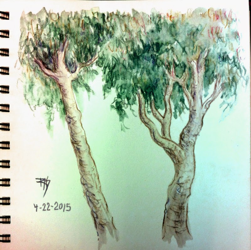
I did sketch last week, the two trees were on the ride to my clinic appointment. Literally sketched while the van stopped, about five different trees went into the composite sketch. It's a common type of street tree in San Francisco that always fascinates me. Washed once I was in the waiting room. I love how Graphitints look, the combination of color and soft graphite is powerful and subtle.

On the same trip I sketched the Wisteria trunk from life, out back of the clinic garden in an area I usually go to smoke. That vine's fascinated me for years, it's thicker than my arm at its base and seems more like an extremely crooked tree than a vine. I put in the fence it grows on and the background later on Saturday after I started adding color. It took several days for me to decide on which watercolors to use, then once I'd painted the vine an leaves it looked awful. Everything was about mid-value against white. So I decided to throw in the loose background and fence and it balanced right. Went from one of my worst to one of my favorites that fast!
I'll be coming back to that vine in future. It's blooming now so I might tackle its flowers sometime.

Thursday, April 9, 2015

Spring Twig and Tree with Shrubs

Spring Twig and Tree with Shrubs
3 1/2" x 5 1/4" Pocket Moleskine watercolor journal
Pigma Micron 01 (black) and watercolor

Yesterday was my clinic visit and the weather's getting successively better. Enough that I was still functioning well after going down the stairs and could draw! 

My elevator's gone down. There's only one antique elevator in the building and apparently it's going to be months before the replacement motor arrives. This bites. It's going to cut deep into my summer plans. Hopefully if it gets fixed by August or September, I might get a 2015 outing late in the year. But while it's down, my best hope is to stay in for all but essential medical appointments.

I was reading a Claudia Nice book on my Kindle when the van stopped to take on another passenger who was late for the pickup. While we waited I saw this lovely sapling with scanty old dead foliage and its first few new spring leaves opening up simultaneously. Had to sketch that from life.

Then snapped photos from the van window and captured a ridge next to the road with trees and bushes and grass. Later in the waiting room, cropped that photo visually and sketched the tree scene above. Both of those I penciled first, then inked with a waterproof pen and then washed with watercolors. I used watercolor markers in Burnt Umber and Sap Green on the twig and washed, tapping the brush tips with the water brush for lighter color. Then used a little pan set of 8 Daniel Smith watercolors on the tree scene.

A couple of years ago I found that Richeson had a tiny children's watercolor set only an inch and a quarter by under 2" with tiny like quarter-pans round pans of kid color. I bought those for my grandkids as stocking stuffers, I got an extra one for myself, popped out the kid pans and filled the empty little plastic openings with Hansa Yellow, New Gamboge, an orange-red, quinacridone magenta or rose, quinacridone gold, pthalo blue, ultramarine and Paynes Grey.

Weirdly that little keychain set has become so handy. I've always got it in pocket, never have a problem with it other than the ultramarine popping out of its hole, just seem to reach for it and mix those colors easily. Bizarre but it's one of my favorites along with my ubiquitous water brush. Love that quinacridone gold, it's the one color that's wearing down fastest!

Friday, February 27, 2015

Cat Sketches


Three cat sketches from the 24th, 25th and 26th. The first is from life. The second, a street tree composed from several different street trees in life with a cat from memory clawing it, third is my Ari again from life in a different position.

All three are done with Winsor & Newton Watercolour Markers on Stillman & Birn Zeta 180lb hot press (smooth) watercolor paper.

I was tagged for the 30 Cats in 30 Days challenge on Facebook, so I'll be doing a lot of little cat sketches until March 5th. If I haven't completed 30 new cats, I'll fill out the number posting some previous cat drawings and paintings.

Till then, even when I'm under the weather it's often possible to do a cat gesture. Ari is usually a cooperative model, at least if I get the sketch in during two minutes. If not, I've sketched him so many times I can usually finish it from memory. I love him so much. The more often I sketch him, the more beautiful everything about him is. Right now he's laying flat doing a good impression of a fur rug with legs sticking out. I'll probably sketch him at least once today too.

#6, #7 and #8 of my 30 Cats in 30 Days. I need to start catching up though, so if I can I'll try to get more than one cat in during a day!

Wednesday, January 21, 2015

Day 21 of 30 in 30 Challenge Sea Turtle

Sea Turtle 7" square
Winsor & Newton watercolour markers
Stillman & Birn Zeta journal (smooth paper)
Photo ref by lisilk on WetCanvas RIL

I went back to the Reference Image Library for something to paint today. I'd seen this sea turtle on the way to finding a bright colored fish and really liked it, also liked the recession of the scene and lost horizon. This was another exercise in blending and combining colors from the markers to get greenish turquoise water shading to green, one that worked well. I played with color on the weeds too to get them fading off into the distance.