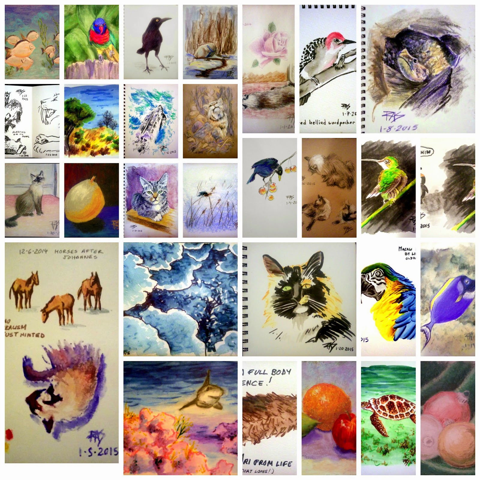
Saturday, January 31, 2015

California Poppy and Cats from Istanbul

 California Poppy
pastel pencil on paper

I started out today's pastel pencil sketches from one of my own photos, an early one from the clinic garden. I just wanted something bright that wouldn't fill the entire page on an 8 1/2" x 11" sketchbook. All of these are on one page from that simple sketchbook. I may actually fill it with pastel sketching.


 Gray Cat from Istanbul
pastel pencil on paper
photo reference by jlloren on WetCanvas.com

Every week there's a Weekend Drawing Event when a member posts sixteen photo references, often from trips they've taken abroad. This time the host went to Istanbul, so I may be back with some skylines with mosques and other architecture sketches tomorrow. I just had to start with the cats though!

Tabby Cat from Istanbul
Pastel pencil on paper
Photo reference by jlloren from WetCanvas.com

This little tabby was so sweet in her expression. I like how both of them turned out. Love the pose on the gray one and the markings on the tabby, subtly brown and blue-gray on the same cat.

30 Paintings in 30 Days Done


Collage of all 30 paintings in 30 days. Some are little sketches, others full layered pastel paintings on various surfaces, various mediums, but I did it! Thought it would be fun to share the collage here too, since I did it.

PicMonkey.com is a good photo editor online. It took me a little while to figure out how to make a collage but once I got it I got it. That was fun.

Now that I've done it, I'll continue daily art Health Permitting. Enjoy!

Friday, January 30, 2015

Day 30 Ari Cat from Life

Ari Cat from Life
7" square pastels on Stillman & Birn Beta journal

Fini! The very last painting for my 30 paintings in 30 days challenge. I thought I'd do something square, bold and colorful. Instead I did something square, soft, tonal and muted. My cat sat in that pose for all of about five or ten seconds. It's usually a prelude to his laying down. I stared at him for the entire time and then sketched fast in charcoal when he moved. So there he is! Fluffy tail and all. I loved what he did with his tail, that little J shape on the ground thing is so cool.

Yeah, well, I love my cat. The carpet really is a vaguely pinkish neutral. The walls allegedly white are faded and stained from years since they were painted, the light in here is yellowish and the door does have those panels on it. He wasn't sitting by the door but he often does, so I simplified the background by not putting in my walker and computer cords and piles of art supplies on the floor where he'd really been sitting. I wanted the wall behind him for definition. Easy matter to look over at the corner by the door for that too.

I will be doing two more pieces today, at least sketches, because I got tagged on Facebook for 3 artworks a day for 5 days challenge by Tammy Gustafson-Vanderbur. I doubted I could manage three a day that long, but she and Dani Day both pointed out I could post older art if I wanted to. So there's a backup plan.

Me, I'm actually taking the challenge to new pieces so that these next five days I do more sketching. I consider it counts even if they are all on the same page. My cat will feature strongly in them, I'm sure.

Well, here's the other two for today, in order!

Pear Study, 6" square pastel on paper

I did this one in the full Colourist style on rough brown sketch paper, loved the way it came out. Played with colors in the background too, shading both hue and value from left to right, top to bottom.

Then after finishing that one, I decided what the heck. I'll do one with a gold background. I love those Metallic Pan Pastels, why not actually set off a colorful subject with them?

Orange On Gold
6" square pastels and Pan Pastels on brown rough paper.

This one I used the Terry Ludwig Sunset set of 14 and also the 14 Best Loved Basics since I needed some browns and darks and other hues to go with the pure bright yellows, oranges and reds. I came very close to the true colors of this bright orange that way, it is searing and gorgeous!

I ate both pears, the little green one from the previous Three Fruits painting and the big green one from today. They were great. Tasted even better for having been painted first!

Thursday, January 29, 2015

Day 29 Rainbow Lorikeet

Rainbow Lorikeet 6" square
Rembrandt pastels on Uart 400 sanded pastel paper

Photo reference from WetCanvas.com Reference Image Library by RubyRedDog2, This bird was one of two photographed in a zoo but I was familiar with Rainbow Lorikeets from some photos years ago by a friend in Australia. I loved those birds. They are insanely colored and very friendly, even wild ones become semi-tame when fed as she used to feed them corn off her back porch. An entire wild flock of them came out for her when she brought them food. Some birds are just sociable like that.

I've seen one photo of an Australian bloke with about nine or ten of them perching on him all friendly, they're really good natured and sweet as your normal little pet budgerigars. I had a budgie as a kid but the Rainbow Lorikeets are even brighter. The little green budgies are almost camouflaged in a tropical forest but these flying jewels are easy to see by any creature that likes fruits and flowers. Gorgeous birds. Can't keep a bird now because my cat is afraid of birds, but I do have some fond memories.

Ari got beaten up by a sparrow when he was only two years old. He didn't realize he was a natural predator to sparrows. The hysterical sparrow did, it landed right in front of him on a shelf in the closet without seeing him. Looked up, spazzed out and flew right up at him beating his poor nose with its wings in dire peril for its life. Ari kept leaning back farther and farther, eyes wide with terror vaguely waving a paw at this mad homicidal flying thing, then made himself all round and fluffed up when it gained enough altitude to bolt out of there.

My daughter, whose cat skills far outstrip my poor indoor cat's, caught the sparrow gently with a scarf and brought it to the open kitchen window to let it out. Poor Ari went off bird watching for months, but finally came to understand that the dangerous creatures can't get through a solid window. So he likes bird watching again but will not go near one without a barrier!

He'll catch mice, but birds are right out of it. None of them are food anyway, food comes in crunchy pellets in bags and I bring it to him. He likes proper cat food, city cats' food, the good low-grain kind. Even wet food is too close to human food for his tastes. As an urban cat with a job taking care of his human, he expects urban services like food processing and the delivery of choice morsels in shiny bags. Gets excited on new-bag day and knows who it's for, but hunting for himself is not something he's ever considered. He's a well paid professional therapy cat and that's how he likes it. Weather doesn't appeal to him either. Climate control and food delivery is a cat's natural habitat, with cushions and things to claw and catnip carrots.

Did a second sketch for the day using Pan Pastels Colorless Blender on most of the page under the sky to see if it'd lighten the colors I put over it. It did beautifully, I had to layer a couple more times to get the darks in. The bottom where the land is didn't get that treatment for comparison.

Storm Sketch, pan pastels on paper
8 1/2" x 11"

The colorless blender is another useful tool. I'm glad it was included in my set of mediums, now that I know what I can do with it. What it didn't do was lighten it right off the sponge if I dabbed in the medium then the color. It will spread out color more than just letting it wear off the sponge and putting it under an area will dilute color going into it to make a soft blended effect.

Wednesday, January 28, 2015

California Hillside Day 28 of 30 in 30 Challenge

California Hillside
8 1/2" x 6" or so, WN watercolor marker on paper

Did another painting in Winsor & Newton Watercolour Markers, this time from a photo I took on my way to the clinic a few weeks ago. Got an interesting tree and a ridge where I changed the shape for esthetic reasons, some bushes and bare trees in the distance. Just fooling around with skies and landscapes, this time in an 8 1/2" x 11" Stillman & Birn Beta journal - rough heavy white watercolor paper that I love for pastels as well as wet mediums. The small one is entirely dedicated to pastels, this one's going to be water mediums or whatever comes to hand. 

Earlier this morning I did a cat sketch or two in my pocket Moleskine, finishing up a two page spread of sketches including figures as well as cats. Figures mostly from imagination, one or two from a poses book I bought.


The month is almost over, but thanks to the 30 in 30 challenge, I'm more or less back to Daily Painting and Sketching. If not a full on painting, at least a sketch! Might be more later or not as I'm going out to the clinic.

Followed up with another sketch under the landscape, this time a life sketch of a big fern out at the clinic garden.

Fern life sketch
Winsor & Newton watercolour markers

Yeah, it is sort of flat on the top like that, oddly enough. It just folds over past a certain point. It's big, about my height and the base very wide. A beautiful reminder of the gentle climate I live in now.

Tuesday, January 27, 2015

Day 27 Heavy Metal Pear

Heavy Metal Pear 6" square
Henri Roche' pastels on Uart 400 sanded paper

No photo reference for this, only the weird shaped little green pear that already got featured in Three Fruits sitting on a black surface that I jazzed up with colors because I could. It wound up having an abstract look and a strong triad color harmony, odd because I never do triad color harmony but this time I like it. The pear really shines. I meant it to look matte rather than shiny, using metallic pastels was a way to give it a particular look that worked well. 

Of course being metallic it also reflects whatever's in front of it. This time I was wearing black so I didn't get that pinkish look on the silver like on Silver Fish. Red or orange shirts do strange things with metallic colors! Or even white, it's a lot of fun for me to wear that orange shirt and come close to a white on white composition in cold daylight where all the shadows are a clear violet cast blue. Ideas for another time.

I'm happy with today's painting and happier still that the 30 in 30 Challenge has helped me get back into daily painting. I might be using watercolour markers for half of them but I'm also sketching more too and sometimes the daily painting isn't the only thing I do in a day. Much thanks to Leslie Saeta for the challenge!

I'll be trying to keep on with daily art during February, weather permitting.

Monday, January 26, 2015

Holiday Ornaments day 26 for 30 in 30 Challenge

Holiday Ornaments
6" square
Pastels on paper

Had a little trouble with the photo on this one, the silver ornament came through pinkish when I got the gold to look right and I don't think the metallic effects show very well. The ornaments are in metallic Henri Roche' pastels while the green velvet backdrop is in Rembrandt and Unison pastels. 

Another page in my pastel journal and another experiment with Roche' metallic pastels. I'll be reviewing these soon, want one more experiment on sanded pastel paper before I post about them.

Sunday, January 25, 2015

3 Fruits from Life day 25 30 in 30 Challenge

3 Fruits from Life
Terry Ludwig pastels on sanded paper

Testing the new Pastel Premier sanded paper, Medium grit, Italian Clay color. I mean to do another painting on the fine grit white before posting my review but I am very happy with this paper, especially this color and grit. Having a nice medium warm neutral to paint on let me play with value a lot and I loved the soft texture of the Ludwigs on it. Got plenty of layering to get subtle colors on the fruits and then still got bright highlights with only medium pressure on them.

This was fun even if I got dusty from head to toe, literally, had to give myself a bit of a sponge bath afterward! Sometimes pastels are messy. But oh the joy when they come out this bright and sing with color!

Saturday, January 24, 2015

Shark Reef

Reef Shark 
3 1/2" x 5"
W&N Watercolour Markers on paper

Used some google images and varied them a lot, didn't really stick close enough to them for anything but the gesture. Made up the coral shapes entirely along with the assorted plants growing on them, played with colors and paper and washes. Found out this lighter weight Stillman & Birn paper still stands up well to the washes and makes for a lovely undersea look. Really had fun with this shark thing, going to be doing more small paintings in W&N markers too.

Today's going to be busy with Johannes Vloothuis class "Essentials of Painting Cityscapes" class two and then home care coming in the afternoon, so I painted early and fast. Tomorrow I might get dusty again.

Friday, January 23, 2015

Day 23 of 30 in 30 Challenge Silver Fish

Silver Fish
8" x 10" Henri Roche' pastels on Strathmore Artagain paper
Photo reference by lisilk on WetCanvas.com

I love these pastels. I have a few precious pieces of Henri Roche' pastels that a friend gave me, and I just got a package from Isabelle at Maison du Pastel with samples of the new Metallic range! Lovely metallics. They have nine gold, nine silver and nine copper variations and on the silver that goes from a near-white to a near-black, making value painting possible in metallic colors. 

I have a number of ideas for these and of course the first one I actually tried is the wonderful iridescence of living fish. If there's any color that seems impossible to be in nature, a fish somewhere will be that color. Be that screaming hot pink, fluorescent green or bright metallic silver, fish come in all the colors humans can imagine or formulate.

That experiment was a total success but the Artagain paper is annoying. I found out the regular Roche' pastels don't like it. The softer metallics adhere beautifully but my beloved Roche' Ultramarine, which seems like it steps up the saturation of ultramarine another two notches sometimes, didn't adhere well at all. 

So I'll be doing another version of this painting or a similar subject on PastelMat, perhaps with some PanPastels underpainting or background stuff. I'm going to play with the subject and test the pastels on several types of paper. I'm betting Canson Mi-Tientes smooth side works a whole lot better than the too-smooth Artagain surface, which just felt like it seriously lacked tooth. I noticed this especially in the coverage of the first blended layers, when I expect quite a lot of adherence it kept moving around and created a lot of dust. Heck, I might even test them in my sketchbook, see what soft vellum drawing paper does. It'd be worth the strokes to do a small orange or something.

Yesterday was spent doing the first layer of this painting and sleeping a lot, so I posted that double page of Ari sketches I did to make up for the 14th and at least had something from this month to go up. Tomorrow who knows? I'll guess when I get there. 

Wednesday, January 21, 2015

Day 21 of 30 in 30 Challenge Sea Turtle

Sea Turtle 7" square
Winsor & Newton watercolour markers
Stillman & Birn Zeta journal (smooth paper)
Photo ref by lisilk on WetCanvas RIL

I went back to the Reference Image Library for something to paint today. I'd seen this sea turtle on the way to finding a bright colored fish and really liked it, also liked the recession of the scene and lost horizon. This was another exercise in blending and combining colors from the markers to get greenish turquoise water shading to green, one that worked well. I played with color on the weeds too to get them fading off into the distance.

Tuesday, January 20, 2015

Day 20 Calico Cat

Calico Cat 7" square
W&N Watercolour Markers on S&B Zeta journal

Today was the reveal date for the Animal & Wildlife "Fur, Scales & Feathers" challenge. I've been contemplating this little calico lady all month knowing I'd paint her today. Well, it was a bit startling to do so in the markers, but that's what grabbed me today. I love being able to get bold and loose with them. She has light gold-yellow warm markings, black and white all on the same cat. Those colors only appear on a female all together, therefore she is a queen.

And what a queen, odd-eyed to boot! She's lovely and I'm quite fond of her. 

Monday, January 19, 2015

Day 19 Tropical Fish Dory

Tropical Fish Dory 9" x 12"
pastel on paper
photo reference by gnu on WetCanvas.com

Today's painting was done for the challenge "has bright colors and scales." I love tropical fish and love that particular blue-violet color, especially on a fish with yellow accents. Went searching in the Reference Image Library for one that color and passed many gorgeous reef references that unfortunately didn't have a screaming bright individual scaled animal standing out. Found this dory, laughed remembering Finding Nemo and painted it anyway.

Tomorrow we'll see a beautiful calico house cat continuing my 2015 Cat Study, also I'll be going out tomorrow evening to a reception for the show I'm in, Vantage Points at the Openhouse GBLT Senior Center. I have yet to see the whole show but sent my home care worker with three of my best, Conch, Colourful Lemons and Pacific Wave. It's going to be fun, we're getting a lecture from an art museum curator and I haven't attended anything like it in more than a decade. At last I get out of the house. This is going to rock.

If I get any good photos I'll post them tomorrow or next day. Wish me luck going out on something that isn't a medical appointment!

Sunday, January 18, 2015

Day 18 in 30 in 30 Bobcat Looking Up

Bobcat Looking Up 9" x 12"
Pastel on paper

Photo reference by stalksthedawn on WetCanvas.com, my favorite source for photo references with permission. Stalksthedawn has done many wonderful big cat photos and must have lived at the zoo for a while to get them, great photos. 

This is the latest in my 2015 Cat Study Project. I'm looking to do more cats, better anatomy, more active poses, putting cats into their environment whether that's my bed or the great wilderness. I have a nice little pen sketch of Ari done from life to post later but might fill those pages in my pocket Moleskine before taking a photo and posting. How I warmed up this morning was stare at the cat and draw him, then proceed to a much wilder cat.

Second art of the day, sketches, not sure if this counts to make up 30 paintings in 30 days but they are fun sketches from life! Double page spread of little Ari!

Life sketches of my cat in pen

Bit of a breakthrough because I don't usually do double page spreads in my journals. I just don't, but this time it happened with the first sketch. I didn't want to vignette him at the hip so I kept going and put in the whole cat. From there it was just laying out to use the rest of the space well. He had a lazy easy day. That's a big part of his job, laying around being drawn because he's beautiful.

Saturday, January 17, 2015

European Blackbird on Winter Cattail Day 17 of 30 in 30 Challenge

European Blackbird on Winter Cattail
Pastels, pastel pencils on paper 7" square

This is one of the paintings done after Blackbird 2 earlier this month. DAK723 gave me the cattail reference in snow, but it looked more like a component of a landscape than an actual scene. It needed something and I knew from first sight what it needed was a bird.

So this was in some ways one of the easiest paintings I've done and others one of the hardest, having to redo that bird an inch long was tricky! I like how it came out though, it makes me smile. Also first use of some of my new Terry Ludwig pastels.

Friday, January 16, 2015

Ari Cat from Life day 16 of 30 in 30

Bedhead! Ari from life
W&N watercolour markers on Moleskine WC journal

After three days so sick I couldn't manage a thumbnail sketch, I headed right into my comfort zone. If I get a couple of good days I still might catch up and have 30 paintings in 30 days. I won't give up till the last day. But today I'm accepting the possibility that it may not be a full win, just a lot of good paintings and more than if I hadn't signed up for it. 

It'd be nice if I could get in a second one today but I won't feel bad if I don't.

Ari cat really is that long when he decides to stretch out as long as possible and as flat as possible. He's not fat, he's just going on 15 years old and has loose skin. If I got down on the floor to get a look at him from the side with my camera, you'd see how flat he was. Maybe 2" thick across the whole and a lot of that is fur. Cats are very strange in their build. The way to tell if a cat's fat is to look down at it or look at it from behind. A healthy one is fairly narrow across. A fat cat will have a bulge in the middle and a wide rear end. Not turn into a carpet with cat parts sticking out at the edges.

These markers are a delight and every time I paint with them I'm getting stronger at exactly what kinds of marks wash out best. The process is different but the results are wonderful and most of all fast! I love being able to paint that swift with confidence and get a good result. If I don't like it I can do it again, that's how I feel about the markers. Go through more paper and don't fuss over getting it perfect. My cat didn't groom himself before posing either.

EDIT: Catching up!

Three Ari Cat Studies
9" x 12" charcoal and white charcoal pencils on Bogus paper.

I suppose I could have photographed each of these separately and been caught up, but I like it as a page of cat studies for my wall. That's where it's hanging now. I have space to hang more on my sketch walls because I removed two pictorial 2014 calendars, left me at least four art spaces - now it looks like five really because I could hang a canvas from the nail the calendar hung on. Might try something in acrylics or oil sticks on a canvas, since I have half a dozen small stretched canvases. Heh, neat, I don't need to change the keywords. Still the same cat!

SECOND EDIT: 10pm
Coral Painting, 5" x 7"
W&N Watercolour Markers on Bockingford paper

Relaxing with an undersea documentary, I realized these flat top coral formations would be perfect for a monochrome composition. I didn't follow the screen closely, only used it for a general sense of their overlapping shapes and relative proportions. Designed this painting almost as an abstraction and I'm very happy with how it came out. This particular Prussian Blue Hue with its deep value range is a wonderful monochrome color. I don't think I'd ever tire of it.

Now I only have to catch up with one more painting, but I can't add another link to Leslie Saeta's blog so I'll have to try that tomorrow, see if I can put more than one painting into a single upload.

Monday, January 12, 2015

Day 12 Penguin Cartoon


Penguin Cartoon on Hummingbird Page
W&N Markers on Moleskine WC journal

Yesterday when I painted the hummingbird I placed him to the right because of the direction his head pointed. I wanted him pointing at the other painting on the page. I had no idea how well this would work till I finished the penguins cartoon from oldrockchick's WDE photographs. By accident, it looks like he's reading the caption and startled by what the penguins are doing!

The birds came up with this. I just drew it. I looked at the photo and the caption just popped into my mind - one of them folding his head back down to hide it in the middle of his back as if embarrassed, the other one putting his beak up all snobby as if to say "I'm not with him." I realized as I sketched it that this was just mutual, they had the same moment in different ways!

Sometimes a good idea doesn't come out perfect. There's a botch in the cartoon where an area of ground got too dark and the Moleskine paper let me lift it more or less to a better value, but also damaged the paper surface. Now I know not to scrub and lift these watercolor markers on Moleskine watercolor paper. Every painting is an experiment. Even failed trials are worth learning from.

But if I were going to publish the cartoon I would either clean it up in GIMP or I'd redraw it from this version. That's fine. Call it a preliminary painting and move on. That's what journals and sketchbooks are for!

Sunday, January 11, 2015

Day 11 of 30 in 30 Hummingbird

Hummingbird
5" x 4 1/2 approx.
Winsor & Newton Watercolour Markers
large Moleskine watercolor journal

I had so much fun yesterday with the Macaw that I decided to go with another bright bird. May have some more art done today as I have some ideas based on other references in the Weekend Drawing Event.

Saturday, January 10, 2015

Day 9 and 10 Dave the Cat and Macaw

Dave the Cat
Pastel and pastel pencils on paper
8 1/2" x 11"

Dave the cat belongs to an online friend in the UK. He's a majestic, regal, spoiled sweet snob whom I've always been fond of at a distance. This isn't the first time I painted him, just the best and most recent. I'm very fond of Dave.

I intended to paint him yesterday for day 9 and so this is making up for yesterday's sick day. Later today I'll post today's piece for the 10th, probably from another reference by Lin Goodwin for the current Weekend Drawing Event on Wetcanvas.com.

EDIT: Winsor & Newton to the rescue, I love being able to paint with their watercolour markers. Strong vivid color, easy to use, they wash out great on the smooth Zeta paper from Stillman & Birn as well as on the cold press Bockingford pad that came with them. That's turning into my favorite pen and wash journal, also pen and wash is catching up with watercolor pencils as a way to handle transparent watercolor. Brush tips are a joy to me.

Macaw
7" square
Winsor & Newton Watercolour Markers
on Stillman & Birn Zeta journal
Photo reference by Lin Goodwin

Thursday, January 8, 2015

Day 8 of 30 in 30 Challenge Rattlesnake in his Hole

Rattlesnake in his Hole
Pastel on paper 8 1/2" x 11"
photo reference by meriadoc from WetCanvas

I'm into nature this month. I had been planning to do another cat, but the animal art prompt was "lives in a hole" and the first cool thing I could think of was rattlesnakes. I've actually seen them in holes in the wild and this reference had a bit of sunlight on his head that was very attractive. So I had fun with it. 

Definitely enjoying Leslie Saeta's 30 paintings in 30 days challenge. It's gotten me going and doing bolder, larger, more colorful paintings. 

Wednesday, January 7, 2015

Day 7 of 30 in 30 Challenge Red Bellied Woodpecker

Red Bellied Woodpecker
5" x 7" W&N Watercolour Markers on wc paper
Photo reference by mollerman on WetCanvas.com

Once again I went to the reference image library on WetCanvas to get some ideas for the day's painting. I meant to get something with a wild cat, but got distracted by a recent post of several red bellied woodpecker shots. Since I meant to do it in just two colors, the black and red bird just grabbed me. Very fast loose painting and I liked how the markers washed out. I love this paper that came wit the set and bought half a dozen loose sheets too because I liked it so much.

Tuesday, January 6, 2015

Day 6 of 30 in 30 Challenge Humpback Whale

Humpback Whale Cow
8 1/2" x 11"
pastel on paper

Photo reference from the WetCanvas Reference Image Library by frangipani, titled "Humpback 3." I sketched her in response to an animals challenge for "a cow" because I knew whales, bison, elephants all use the same terms as cattle, bull or cow. 

One thing I like about this sketchbook is that it's getting me sketching large. While I enjoy using the small sketchbooks I've been doing a lot more pastels with the big pages, and whatever pastels are handy. This time it was the Mungyo Standard 64 color half sticks set, a student set I picked up on Amazon cheap. They are the best, handiest student set of pastels I've ever used, perfect to introduce someone to the medium with a big enough range to really get a feel for it and not get bogged down in substitutions.

Monday, January 5, 2015

Winter Boulder day 5 for 30 in 30 Challenge

Yes, I signed up for the 30 Paintings in 30 Days Challenge. I was nervous about it but I have done four pastels in five days, so I'm only behind by one. Today's painting is a loose sketch of a winter landscape from a photo by DAK723 on WetCanvas.com, a scene I hope to revisit with an animal one of these times.

Winter Boulder
8 1/2" x 11"
Rembrandt pastels on paper

That basic drawing book I got for Christmas is getting a workout. It's handy, it's white, I don't feel bad about experimenting in it and the paper's toothy enough I can do at least general loose paintings on it. 

I have some new sanded paper too though, so I want to develop some of these things a bit more. That boulder really needs a big cat on it. My first thought was a cougar, but now I think a lynx or bobcat would fit even better, lurking to see if a rabbit or something comes down that trail. Bobcats are fun and I haven't done one stalking in the wild yet. So this is a preliminary.

For my 30 in 30 challenge, preliminary paintings do count as long as they're in pastels and in color. They have to be more than just a charcoal sketch, that's all. So far I have 4 out of 5 so that's not bad at all.

Then later tonight I did a little watercolor sketch of Ari cat for a sketching challenge - use primary colors. So I painted a brown cat in primaries.

Ari cat in Primary colors watercolor
Little horses in Winsor & Newton watercolor markers

I sketched Ari from life of course and the little horses are from a Johannes Vloothuis watercolor demo.

Sunday, January 4, 2015

Black Bird 2

Black Bird 2
pastel on paper

Photo reference by Dorothea Schulz, aka theodorablau on WetCanvas. She posted the photo to my other black bird and I had to have a go at this pose. Nothing like the first one, very fascinating in terms of anatomy. I used Henri Roche' pastels, a friend gave me a few precious nubbins of those so I was working with a limited palette and full range of values. 

Friday, January 2, 2015

Black Bird, Ari Cat and Rose

Catching up for a couple of days past...

Black Bird
pastel on paper 8 1/2" x 11"

Today's black bird is for the Weekend Drawing Event on WetCanvas, hosted by artbyjune who provided 16 photo references and a challenge. I finished in under two hours so the challenge is there. I've always been fond of grackles, starlings, ravens, crows, any black birds. Their iridescence and dark intensity are beautiful to me and of course this one had a great pose.

Yesterday I sketched my cat in pastel pencil for the first art of 2015, on the same page as Wednesday's colored pencils lavender rose. So the last art of 2014 and first of 2015 are also in the same letter size sketchbook.  I'm having fun with this one, a gift that really got me going!

Lavender Rose in colored pencils 12-31-2014
Ari Cat in pastel pencil 1-1-2015
Happy New Year!

Ari was from life of course, he posed near the door and I sketched him mostly before he moved, did some shading after he changed pose slightly. The rose is from my own photo while I was out at the clinic garden. 

Now if I can just remember to post daily when I draw daily, all's well!