Showing posts with label life painting. Show all posts

Saturday, April 23, 2016

Red Rose and pastel landscape progress

Red rose in Derwent Graphitint on paper

Yesterday, my beautiful granddaughter Sascha came home from a walk with a lovely large red rose that was blown off a neighbor's bush with about half an inch of stem. It's still sitting in its saucer on my desk. I had to sketch it, so decided to use strong, soft Derwent Graphitint watersoluble graphite pencils. Dry, they're like 8B graphite pencils with a hint of color. Washed, that hint of color becomes a lot stronger but still has a subtle graphite sheen.

When I use pencil I love the softest graphite pencils, so these have been favorites for a long time. I'm not the sort of artist who shades by five or six or more delicate layers with a hard pencil. Scribble and smudge, give me sweeping motions and strong contrast right from the start! So these are a lot of fun and I've got quite a few of them - by accident at the moment I've got maybe 3 sets of 12 but can't find one of the sets of 24 that I acquired, so I need to replace that. But having an extra won't hurt! 

How I wound up with small sets was their inclusion in trades and gift sets. One of the small sets is in an awesome zipper case with watercolor palette, hardcover sketchbook, other sketch and wash pencils and a waterbrush all in an easily carried case. Can't find its native waterbrush but have so many Niji ones it'll be easy to replace.

Iris Hill and Oak pastel plein air

This is something I started day before yesterday, when the rain stopped and I hung outside with my farrier daughter while she fixed her truck. It was sunny and beautiful, the foreground in shade with this sunlit patch beyond the trees blazing behind the iris hill. The iris patch extends far to the right too and into the distance. I might be able to finish just from what I have done already... or I might go outside again to finish, which would be truer to the scene.

I used a complementary water underpainting, scribbled masses in pastels and then washed with a waterbrush. Paper is a tan Canson Mi-Tientes Touch piece, drawing board a battered aluminum clipboard with a box underneath that exactly holds my 60 Rembrandt half stick pastels. Might hold 60 Great American half sticks even though that box is slightly larger too, have to try that. Obviously not at the same time, but pretty handy for going outside!

In fifteen minutes I have Johannes Vloothuis class online so going out won't be till later. I'll see how I feel, if he gets me all wound up to paint I might amble out, but if the chronic fatigue or arthritis bites I might not. Pretty tempting though, it's sunny and lovely out there again!

Thursday, April 7, 2016

Dried Leaf in Pen and Watercolor

Dried Leaf in pen and watercolor
3" x 5" cold press watercolor paper.

Only three empty pages left in this little journal! It's cool coming to the end of one. I don't know what I'll do on the last pages but I love its thick paper that doesn't bleed through no matter what I do.

This morning I looked down and saw this leaf. It's old, most of them are just a reddish faded brown - but this one had deep violet-blue areas and patches, some in shadow and blued still more by reflected sky. I know sometimes they turn black as they degrade into soil, this was a stage in that process. So I had to draw and paint it, the unusual colors and sharp dark shadows grabbed me.

Friday, April 1, 2016

Aerial Perspective and Lilies

 Rain Recession, watercolor 3" x 5" trees and clouds

Lilies and Stone Wall, pen and watercolor, 3" x 5"

I'm happily filling up the little Strathmore Visual Journal with its coarse 140lb cold press watercolor paper. It's small, it's handy and it's a good journal for wash techniques thanks to the heavy paper.

Rain Recession is what I painted on 3-29-2016, a view from the window over several layers of trees on a rainy-misty day. I loved the view and will probably do it many times, as Spring progresses it gets greener and greener. Living here on my daughter's farm in Arkansas, I'm surrounded by paintable scenes and almost any change in weather gives them new charm. I didn't add pen details because when I finished loosely painting, it didn't need them.

What I did though was condense trees from several angles into the painting. It's not a photo of the window view so much as an impression. I've gotten away from exact realism and even make small rearrangements on botanicals without losing the identity of the plant. It just has to be plausible. Removing a leaf or two in imagination or adding another flower that's on another plant but at an angle that'd improve the composition doesn't change that the plant can be identified by someone that knows it. It's not a portrait of that exact plant.

My son in law got that Easter lily in a pot with purple foil around it as a gift after volunteering at his church. This happens often to people who belong to big churches that really lay on the floral displays, many poinsettias go home with folks too after a big Christmas mass.

So he put it in the little garden patch in front of the house, where it tipped over and leaned against the short mossy stone wall defining it. There's stone-edged plots on both sides of the door and a pathway of big flagstones between them, which is very cool. I loved the way it looked and the day he brought it home, it hadn't bloomed yet. Now it's opening up.

So yesterday I sketched it in pencil, inked with a Pigma Micron size 01 and brought it inside to give it a watercolor finish. I do intend to paint it again later in more detail, the reflected colors on and inside the white blossom are beautiful and the inside trumpet has a smear of yellow that I thought was reflected but is actually pollen that fell off those stamens. I got a good long look at the structure and today got some more photos of it along with outdoor cat Calcifer.

He's one of three official Barn Cats who keep the rodents down around the grain kept for horses, goats and chickens. All three are sleek, well fed, perfectly groomed with silky coats and very affectionate personalities. I got a wonderful photo of him with the lilies today, one I may develop later as a serious painting.

The flowers seem to glow a bit due to the camera, but the cat's great and I can work on shading the flowers later after studying other photos where the flower's the main subject. The day is overcast, which helps!

Calcifer and the Easter Lilies

He's a sweet, super friendly lap cat. When I go outside to sit in the lawn chair and smoke, Calcifer is my number one lap warmer. Dampness, chilly weather, rain, anything inclement will guarantee a warm lap cat purring loud and cuddling. Calcifer likes it even when it's nice and sunny. Sometimes I stay out longer petting cats and talking with my daughter, the spot right outside the door has become our lounge area.

I like that habit. I'm smoking a little less because it takes a few steps and some effort to get out there, seeing a lot more of the yard and getting lots of sun on good days. It's also helped me get out of my chair a little more unless I'm really, really in bad shape. I didn't realize how much I stayed indoors till I moved here to have a good place in reach to go outside and good models always in sight. The chickens hang out there too on and off, which cuts way down on bugs. I may not need the Vitamin D supplements any more, unless it's winter and I get the winter problems that led me to take them in the first place. It's a good feeling.

Today I might be fooling around with colored inks and dip pens since my Blick order came in on the 30th. Twelve year old granddaughter got her birthday present early, a big set of Snazaroo face paints and the small set of six crayon face paints for drawing on her arms. I couldn't resist her excitement! The rest was all colored Bombay India Inks, silverpoint supplies and new dip pens, so I'll be experimenting with both period medieval stuff and modern pen-watercolor things with all those colored inks.

Crowquill dip pens give a very fine line like a Pigma Micron or Rapidograph but are as easy to clean as a brush and don't clog. Also even if I wreck a point, the nibs are so much cheaper! They also change colors as fast as a brush so I could really have some fun with the Claudia Nice style of pen-watercolor stuff!

Tuesday, March 15, 2016

Leaf in Pen and Watercolor

Leaf in Pen and Watercolor, 3" x 5"

Still using the small Strathmore Visual Journal. This morning I had a medical appointment that became very stressful. I noticed a leaf on the ground and brought it in, sketched it in the waiting room.

Had some fun charging color into color on the main leaf. The original was completely dried but I brought back some autumn color into it and then gave it a dry brushed loose background because my first swipe with the brush had broken color. I loved the way that looked and just continued with the same strokes.

Monday, March 14, 2016

Kyra kitten and pen sketches

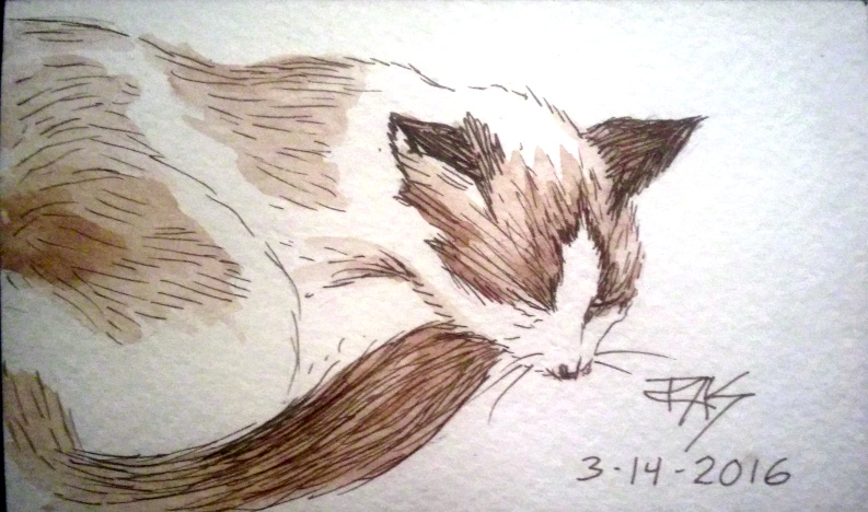
 Kyra Kitten from life, sepia pen and watercolor, 3 x 5"

 Pen sketches of Capricorn the lamb from life, 3" x 5"

Pen sketch of Kyra Kitten from life in the window, 3" x 5"

Today was a good day for sketching. I penciled those lamb sketches yesterday and inked them today, decided they did need inking. Kyra Kitten in black was my first sketch of her while she sat in the window looking lanky. Then she went to sleep on the box of my art supplies looking adorable so I had a good long time to sketch her in detail, pen and wash the sketch.

I'm getting to know my new kitten and how her features differ from Ari's. She's much more slender, very long and delicate. Her facial structure is different with a tiny, almost pointed muzzle, big ears, lovely big eyes that sometimes look dark but are a very bright blue. Her markings are a little more distinct every week, she has Siamese points broken up by the white blotch pattern that gives her white feet and the white muzzle and flame-face shape. She's adorable and unique, not your standard cat at all!

And I have still more cats to draw and profile, the small black female longhair Toothless formerly Midnight, big plump gray and white China Princess who rules the house. Outside we have three barn cats: gigantic golden Maine Coon Tom Sutekh, lovely small tortie super long hair Sekhmet and the classical brown mackerel tabby Calcifer. All of the barn cats are very affectionate and when I go out for a smoke, I get a lap cat most of the time purring and wanting pets. I love having so many cats here, they're all beautiful.

Plus there's the big flock of assorted chickens, the Muscovy Ducks that look like Tim Burton would put them in Halloween Town, the pregnant goats, two dogs and several horses. I've got so many beautiful subjects that I'd better start doing more than one a day, at least when the weather's good!

Sunday, March 13, 2016

Capricorn the Lamb in pen and watercolor

Capricorn the Lamb
3" x 5" pen and watercolor

Still enjoying the small Strathmore Visual Journal. A neighbor lost a mother sheep to drowning in the pond and gave her orphaned male lamb to my granddaughter Sascha. She named him Capricorn and is having a ball playing with him in the yard. He heels like a little dog, follows her around and gets bottle fed hourly. 

So now I have yet another species to paint and draw. Capricorn has an interesting fur texture with lovely well defined Botticelli waves, so I may do some other studies before he's grown and his wool looks woolly. He's very tame and sweet. 

I'm glad to be back to daily painting or drawing and as usual, if I do any more today I'll edit them into this entry.

Saturday, March 12, 2016

Kyra Kitten from Life in Pen and Watercolor

Kyra Kitten from Life, pen and watercolor
3" x 5" short hair Siamese cat with white blotches.

Kyra was sound asleep on a chair, so I managed to capture the endlessly moving Bumble Kitten inert just long enough to pencil her - and get her unusual proportions accurately. She is a very long, thin kitten. Muscular rather than bony, she sometimes resembles a leggy, furry snake! Long long neck. Long face. Long legs actually too, she just has that Siamese lanky build. Beautiful blue eyes, white muzzle and white patterns on her body and legs.

When I first met her, she seemed white all over but as she ages, the faint blotches of beige Siamese-colored fur are popping up more intensely. She now shows the unique markings that make her my Siamese Crossed With A Snowpatch!

Instead of pan watercolors, I used 24 Cretacolor Aqua Monolith pencils and washed out the penciling, keeping my colors soft and natural. The blue-green cushion's a bit lighter than life but I did that to keep the painting soft.

Love my Bumble Kitten! She's been good for Ari - she loves him and constantly teases him to play!

Wednesday, March 9, 2016

White Hen from life

White Hen, watercolor on paper, 3" x 5"

Nothing yesterday, but today I was outside and saw the white hen "Sun" sitting and strolling on a short stone fence around the garden patch in the front. I was going to paint my hyacinth again since it's opened, but Sun grabbed my attention. Had fun mostly negative painting her with loose background greens and browns, then getting the rich shaded soft green moss on the rocks.

Will be doing more tomorrow, I think.

Monday, March 7, 2016

Bradford Pear and Hyacinth from Life

 Bradford Pear flowerng tree watercolor on paper, 3" x 5"

Hyacinth bud about to bloom, watercolor on paper 3" x 5"

Two pages in my little Strathmore Visual Journal today with Sakura Koi pocket box pan watercolors. I did pencil under them but haven't inked. 

I went out to get my prescription, so while waiting painted the Bradford Pear blooming in the parking lot. I left out most of the rest, buildings and cars and asphalt, in favor of a field and some more distant trees or shrubbery. Brightened the sky too using a cobalt blue hue that I suspect is actually Pthalo Blue from its brightness - albeit Red Shade.

Bradford Pears are an invasive ornamental tree. They bloom copious white blossoms in the spring, leaf out bright and green then in the fall become gorgeous again shading from lemon yellow through oranges to red and even a red-violet. They're a bit small for trees or really large for shrubs, tend to be symmetrical and seed themselves easily. The fruits are tiny and bitter, birds eat them and spread them - and of course they are invasive so they may crowd out native shrubs and trees sometimes. But they are beautiful and still sometimes planted on purpose.

Then once I got home I set out my impulse purchase, a $1 hyacinth in a pot. Most of my life I've seen and been tempted by those springtime racks of flowering little plants, some annuals and others perennials. Usually I didn't have a place to plant it. 

Sometimes I got talked out of it in favor of buying seeds instead that somehow I never followed through on planting, if staying with people who have  a yard. But I'm disabled! The more labor intensive type of gardening is not necessarily the best idea for someone with limited physical activity!

So instead of going overboard on them I bought one little hyacinth and I love it. The color's a nice rich violet-blue and I'm sure it will bloom bright. It may even survive  from year to year the way the many jonquils around here do. Kitten helped me plant it in the patch in the front where I usually sit outside, so I'll enjoy its blooming and maybe for years more see it split and expand providing a complement to the bright yellow jonquils.

Even if it doesn't, it made me happy and I painted it.

A chicken pecked it already so we may have a problem later on - though it will be raining for the next few days so I might be doing more indoor stuff from references. Or cats. It's not like I don't have several beautiful models inside!


Sunday, March 6, 2016

Jonquil and Rooster from Life

Jonquil and Rooster from Life 3" x 5"
watercolor on paper

They're not to scale, just two watercolor studies on a small Strathmore journal with my Sakura Koi pocket box watercolor set. I didn't use pen on them either, but did pencil the jonquil before painting.

It's been nearly a month since I did anything. I got bronchitis which turned into pneumonia and wound up in the hospital, which was a major bummer. Too weak to do anything, even sketch, I've spent most of the month sleeping or coughing and wishing I could paint this, that or the other thing. Today I felt up to doing so and am getting significantly better every day. The worst is definitely over.

I hate winter, but spring is here early and wonderful. Love the flowers coming up everywhere, jonquils abound around the farm house. Also the flock of gorgeous chickens including Black Marins, my favorites. They do get weird fluffs of feathers on their feet, the rooster in the painting has those fluffs.

Hopefully to be continued...

Thursday, November 12, 2015

Pears from Life

Pears from Life
Neocolor II artist crayons on large watercolor Moleskine

Today's painting is actually catching up for yesterday, unless I get in another sketch or something I'm still one day behind. I probably will though. This took me a while since I did the first layer lightly and washed it. The whole page curled up when I did and you can see that original wash in the background that I didn't color over because I liked it - a mix of black, Ultramarine and white layering.

I used the same light green artificial pear for all three views, rotating it to see it at different angles. It's not perfectly symmetrical and I also deliberately let it vary a bit in my rendering, not worrying if I made it a little fatter or shorter. I played with color on all three versions and pushed one way back by fading out the colors with white - which showed up more in the photo than the original. But color adjustments in photos are tricky at best, get one area looking true and some other area will be washed out or too dark or too blue or something.

It's one step more intense than the chalky looking thing in the photo, more like a solid Naples Yellow than a pale grayed beige. The shadows did do that double ring effect too. Values are about right, it just paled out because of what's probably gamut issues.

Oh wow! 200th post! Just noticed that! Yay, been at it a while with this blog. Onward!

Tuesday, October 13, 2015

Pear and Paint Page pen and watercolor

Pear and Paint Page
7" square pen and watercolor

This is the facing page next to Bird and Pen Page, showing the tools I used except for painting the Niji round waterbrush I used for all the painting.

That irregular pear, more ovoid than pear shaped, turned up in my lunch. I love the way it looks and may turn it to sketch it again. It's a bit lopsided and crooked, the less perfect fruits are always the most interesting to paint! It also has a lovely color, a rosy side that's also the flatter side.

Then to fill the page I sketched my porcelain palette set up with a spectrum of American Journey Ultramarine (purple cast blue), Alizarin Crimson (quinacridone) and Joe's Yellow which is about a Cadmium Yellow Medium hue for actual color. Way too orange cast for my taste, the greens all come out olive or grayish. The center has palette mud brown-gray, which I throw bits of primary colors into to balance it more brownish or grayish.

Right now having tested the paints I'm trying to use them up and also come up with the right illustrations to write up the brand. The yellow really is quite a lot like a cadmium because it's also leaning opaque. I tend to prefer more transparent yellows. But that's okay. I may add to the triad later since this brand is reasonably priced and good quality, artist grade, just really needs a lemon yellow and a pthalo blue and maybe either a bright orange or a warm red.

Thursday, August 13, 2015

Colorful Peach

Colourful Peach
5 x 7" Pastel on Paper

This small painting took me two days and a number of experiments. I used Unison pastels on Canson Mi-Tientes and loved the way the smooth side kept taking layers. There are eight or nine layers on the more detailed areas of the peach. 

One of the hardest fruits to paint is a peach because of the soft pale fuzz over the whole thing. I added that last and sweated over every light stroke,  but succeeded in getting the haze that appeared mostly around the edges in real life. The photos I took enhanced that and paled the entire fruit, but I worked from life right to the end. I changed the colors of background and surface but not the angle.

I got a bit playful with the shadow and liked the way the colors played within it, so decided to leave that more whimsical than literal. The photo's a little off but in person it has some peacock iridescence that I loved seeing. I could have muted it more to get a more realistic effect but decided not to for artistic reasons. So it's one more step away from literal representation. I knew what I needed to do but that pool of color reminded me of completely different subjects and I liked it.

I can always experiment with these. The realist triumph here was the fuzzes, the shadow can be more transparent next time.

Monday, August 10, 2015

Two Apples pastel on paper

Two Apples from Life
6" x 9" pastel on Moonstone Canson Mi-Tientes paper smooth side

I reorganized my 48 Color Conte to all fit neatly into an old 24 color Conte box, just broke the sticks in half and put two colors in each slot. One red piece is just a touch too long and sticks up, so I started something I'd use that red on. It went well! The apples are on a black refrigerator top but I livened that up with various dark colors and threw in a little reflected color still with the same red.

Sunday, August 2, 2015

Bright Pear Reflecting

Bright Pear Reflecting
Pastel on paper, 5" x 7"

A few days ago, I got a lovely set of 15 Caran d'Ache Soft Pastels, a wonderful assortment for a Colourist with bright saturated colors in warm and cool, plus my favorite three earths - yellow ochre, reddish earth and dark brown, black and white. It's a perfect small range. I also finally after literally decades of wanting to do so, bought the full range of Canson Mi Tientes colors in full sheets.

The first time I wanted ot stock that paper in all its colors at home, I was a teenager and it cost too much. For all those years and decades, I bought a sheet or two at a time. Or a dozen sheets a week sometimes when I did portraits in New Orleans, often trying out a new color or two.

I've spent far more on other supplies, watercolors, great brushes, pastels and colored pencils sets. The whole stack cost me less than $80... so my putting it off was rather silly. Now it feels as if I have the whole art store at hand. 

The color I used today is "Oyster." It's also in the basic pad which has been a lot of how I got my Mi-Tientes over the years, convenient size at 9" x 12" and easy to cut those sheets in half for smaller works. I'll be cutting down the big sheets the way I did in New Orleans on a good day, then store them sealed in a plastic tub to avoid attracting bugs. That big a paper stock can easily be bug damaged or water damaged. I may do the same to the big watercolor paper sheets in there and lightly pencil brand on them. Especially the tinted Bockingford sheets.

Last, this evening when I was done, I tried out my new Pentel Pocket Brush pen. It's surprisingly great! I read about it on Gurney's Journey and had to have one. As mentioned, it takes a little learning curve to control the very fine tip, but is wonderfully responsive. Some sloppy sketches before this and then this Ari gesture since he looked up at me squinting with his eyes nearly shut, just, face turned up and ears interested.

Ari Cat from life
8 1/2" x 4" Pentel Pocket Brush Pen on paper

Love the responsiveness of the pen and the very fine lines it can get. Practice will improve these but I'm very happy with this cat gesture!

Wednesday, June 17, 2015

Watercolor Ari Cat from Life

 Watercolor Ari Cat from life - a first!

Or at least a first success. I may have tried painting him in watercolor without pen work before, but this ime it really worked. I love my beautiful cat. He's been my favorite model from the moment I met him fifteen years ago. He was six weeks old and looked like a Hallmark card kitten. Although I long since lost his kitten pictures and any sketches I did from him at the time, looking at the enormous fifteen pound beast I can still remember when he fit in one hand, weighed nothing and had tiny paws no bigger than the tip of my little finger.

I've painted him in most of the mediums I own, usually from photos until a few years ago when I started a series of Ari Cat Gestures. He only holds a pose for two minutes at a time usually. So I was stunned that today by a moment's whim, I crossed the great divide into watercolor sketching by not even thinking about it.

I packed up a bag to take with me for today's clinic visit. I put my Zeta journal and some watercolor pencils into a plastic zipper bag full of small oddments and supplies, the bag from a Walnut Ink Set that I got at Daniel Smith. It was a good bundle with an 11" x 14" waterproof zipper bag, bottle of watersoluble walnut ink, hard bound journal, two bamboo pens, sepia Pigma Micron 05 and maybe a couple of other things for a good price. Though I used the pens and ink and journal, the bag has been fantastic. Good sized, more or less rainproof and limited enough that I don't haul forty pounds of supplies when I use it. More than once it's saved watercolor and pastels paintings from rain, tucked into the carry cache of my rollator.

So what I had left out was my 24 color Yarka Professional Sequel Set. I used to have a set of 24 Yarka Original full pan watercolors and loved them, but gave it to a friend on the basis that I had way too many pan watercolor sets. Then I missed it - and realized I'd really wanted Sequel, which included a Rose color. I've got better primaries in this lineup, plenty of saturated colors in the Sequel selection. Three reds, two or three purples, three or four blues, four greens, only the most essential neutrals but those include my beloved Payne's Grey.

I charted them into the back of the 8 1/2" x 11" Beta journal, 180lb rough white watercolor, just because like many artist grade watercolors, a number of them looked black in mass tone. Forgot the names and guessed. I think now that what I labeled Sepia is actually a warm mineral black with a Russian name.

Then I looked up and saw my cat curled up peacefully in a lovely sleep pose. An easy sleep pose on a gold brocade coverlet. I grabbed a pencil, decided to pencil him before inking because I was sure he'd move and I wanted the shapes of his body in repose.

Several swift lines and I almost shaded... then realized wow, he hasn't moved. I could try this in watercolor, maybe capture the nuances of his old man kitty markings. Siamese and colorpoint cats darken as they age. Ari has done so and he's done it oddly, with some unusual dark patches like middle of his shoulder blades and that gorgeous pale ivory ruff. I picked up the warm neutral and blocked in the values fast, then started detailing with Payne's Grey where he turns truly black with a cool highlight - his face mask except for the edges and his trademark black ears. His tail and paws are a smoky cool brown a couple of steps lighter than his face. He is unique.

Ari Cat watercolor in context under 24 color Yarka chart

I worked fast with a Niji waterbrush. I love round brushes anyway and am very used to the Niji for quick watercolor sketching. The page isn't full but I'm posting it anyway. I might finish it out in the clinic garden.

I unpacked the bag, took out my Zeta and a lot of the loose little things that got stored in it, I've still got the watercolor pencils packed tight in a 48 color Global Classic leather case, but that could go in my jacket pocket if I want them. Seems like today might be a watercolor day instead.

A dear friend accidentally got two copies of Perspective, Depth and Distance by Geoff Kersey. She gave me the extra one, so I've been happily reading and enjoying Mr. Kersey's lively, detailed yet loose watercolors. I might tuck that in too and just go with watercolor today. It feels like a watercolor day!

Soon though, I'll do the next stage on the pastel landscape demo that I started thumbnailing on the 4th. I've done a color study for it and even the previous watercolor was almost a preliminary, certainly an exploration of stormy skies. By the time I'm done the photo reference might be unrecognizable but that's all right. 

A photo reference is there for ideas and details, not true color or values or composition or anything. Composition is just copying the photographer's art. Color and values are almost never true and usually adjusted by the photographer anyway. So what that leaves is form and details, a little distorted although that matters most on straight verticals and horizontals. I changed a lot of things in it to suit my vision and didn't even stick with the layout I got in the color study, so it's turning into a demo on design! Should be fun when I get to it. This morning I don't want to even think about getting dusty though. Not when I leave in an hour and need to conserve energy.

Tomorrow I'll be home and hopefully feeling better after my treatment. That always balances against exhausted by going out sans elevator but last time I did pretty well. Wish me luck this afternoon!

Thursday, June 4, 2015

Floral and Botanical Watermedia

Orange Poppies
5" x 7" W & N Watercolour Markers on Bockingford WC paper

Yesterday, despite ludicrous physical overexertion, I did some pretty good sketching with different water media. First, in the waiting room at my usual clinic visit, I used a photo I took last month to sketch some orange poppies that grew out in the SFGH Memory Garden. They were done blooming, replaced by some orange and yellow daisies in the same bed, but I'd gotten photos as I do almost every time. That helps when I need to find something interesting to sketch in a relatively dull waiting room.

Botanical sketches in pen and watercolor

Outside in the garden I got plenty of photos. Then went to the patient pickup and dropoff zone to sketch some interesting plants from the bed around the big fern. I've come to know that little patch intimately too. Didn't get the azalea bush, it was bloomed out, but an odd little bush with leaves that turn reddish at the tips of clusters and little sprays of waxy cream-colored small blooms, plus the copious plant that's dark red on the underside of its leaves, the tree or large shrub with gray green leaves with cream edges, one leaf of a big-leafed ornamental plant with reddish edges and a small bright green weed that appealed to me. I don't know the names of these plants, but I did want to sketch and remember them. 

I don't need to have a yard as long as I've got access to that beautiful a public garden. I like it even more for not having to keep it up.

Thursday, April 30, 2015

Wisteria Trunk and Two Trees from Life

 Wisteria Trunk, 7" square
pen and watercolor in Stillman & Birn Zeta journal

Two Trees from Life
Derwent Graphitint, washed, same journal

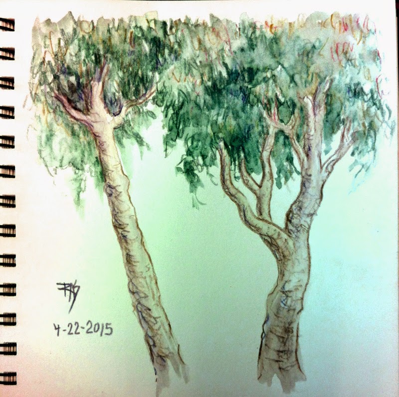
I did sketch last week, the two trees were on the ride to my clinic appointment. Literally sketched while the van stopped, about five different trees went into the composite sketch. It's a common type of street tree in San Francisco that always fascinates me. Washed once I was in the waiting room. I love how Graphitints look, the combination of color and soft graphite is powerful and subtle.

On the same trip I sketched the Wisteria trunk from life, out back of the clinic garden in an area I usually go to smoke. That vine's fascinated me for years, it's thicker than my arm at its base and seems more like an extremely crooked tree than a vine. I put in the fence it grows on and the background later on Saturday after I started adding color. It took several days for me to decide on which watercolors to use, then once I'd painted the vine an leaves it looked awful. Everything was about mid-value against white. So I decided to throw in the loose background and fence and it balanced right. Went from one of my worst to one of my favorites that fast!
I'll be coming back to that vine in future. It's blooming now so I might tackle its flowers sometime.

Monday, February 2, 2015

Fruit Studies in Charcoal and Pastel

 Charcoal pear studies 8 1/2" x 11"

My cold is starting to break up, so this morning I decided to sketch in something bold enough it'd be easy to get a photo. I love doing charcoal sketching. It's so easy to get good strong values and model the forms by sketching and smudging. I use a peel off the wrap charcoal pencil, so I don't have to bother sharpening it or getting charcoal stick on my fingers. When I feel like going to charcoal I want clean and easy.

Two pears, an apple and an orange
Pastel pencil on paper 8 1/2" x 11"

Still in the same plain sketchbook I got for a Christmas present, I got into color and sketched all the fruit I had left. I ate another pear, the big orange, the smaller apple and a banana. But didn't want to eat all of it before sketching, especially those quirky bumpy off-shape pears. The nice thing is that pear shapes don't need to be symmetrical. Real ones are lopsided, lumpy, bumpy and have strange hue shifts along their sides. They come in so many colors, sometimes all on the same pear from green to pinkish! 


Two Pears 9" x 12"
Rembrandt pastel on Bee Bogus Recycled Sketch Paper

After that, I decided to add one to my sketch wall. First loosely sketched in charcoal and then started using my Rembrandt half sticks. I layered them quite a it to get subtle color changes, especially between greens and earth reds and earth yellows with a touch of violet - yeah, most of it is complements. The shadow's been glazed over with a light violet but has a good five or six dark colors in it from gray and blue to brown and green and violet.

So today was a good day for playing around and most of all working large. For me anything 9" x 12" is big, when I'm used to using small journals or doing 6" square or 5" x 7" paintings. 

Friday, January 30, 2015

Day 30 Ari Cat from Life

Ari Cat from Life
7" square pastels on Stillman & Birn Beta journal

Fini! The very last painting for my 30 paintings in 30 days challenge. I thought I'd do something square, bold and colorful. Instead I did something square, soft, tonal and muted. My cat sat in that pose for all of about five or ten seconds. It's usually a prelude to his laying down. I stared at him for the entire time and then sketched fast in charcoal when he moved. So there he is! Fluffy tail and all. I loved what he did with his tail, that little J shape on the ground thing is so cool.

Yeah, well, I love my cat. The carpet really is a vaguely pinkish neutral. The walls allegedly white are faded and stained from years since they were painted, the light in here is yellowish and the door does have those panels on it. He wasn't sitting by the door but he often does, so I simplified the background by not putting in my walker and computer cords and piles of art supplies on the floor where he'd really been sitting. I wanted the wall behind him for definition. Easy matter to look over at the corner by the door for that too.

I will be doing two more pieces today, at least sketches, because I got tagged on Facebook for 3 artworks a day for 5 days challenge by Tammy Gustafson-Vanderbur. I doubted I could manage three a day that long, but she and Dani Day both pointed out I could post older art if I wanted to. So there's a backup plan.

Me, I'm actually taking the challenge to new pieces so that these next five days I do more sketching. I consider it counts even if they are all on the same page. My cat will feature strongly in them, I'm sure.

Well, here's the other two for today, in order!

Pear Study, 6" square pastel on paper

I did this one in the full Colourist style on rough brown sketch paper, loved the way it came out. Played with colors in the background too, shading both hue and value from left to right, top to bottom.

Then after finishing that one, I decided what the heck. I'll do one with a gold background. I love those Metallic Pan Pastels, why not actually set off a colorful subject with them?

Orange On Gold
6" square pastels and Pan Pastels on brown rough paper.

This one I used the Terry Ludwig Sunset set of 14 and also the 14 Best Loved Basics since I needed some browns and darks and other hues to go with the pure bright yellows, oranges and reds. I came very close to the true colors of this bright orange that way, it is searing and gorgeous!

I ate both pears, the little green one from the previous Three Fruits painting and the big green one from today. They were great. Tasted even better for having been painted first!